Kadence
Waypoint Starter Template Setup & Customization Guide
Kadence Starter Templates provide complete, professionally designed website layouts built to help you launch sites in minutes. Every starter template is powered by the core Kadence Theme and Kadence Blocks, giving you full design flexibility, fast performance, and clean WordPress Block Editor (Gutenberg) architecture out of the box.
Understanding Free vs. Pro Starter Templates
While all templates rely on the core Kadence framework, specific layouts use advanced premium features:
- Free Templates: Require only the free Kadence Theme and the free Kadence Blocks plugin.
- Pro / Premium Templates: Use specialized styling, animations, dynamic layouts, and premium blocks.
Important: The required plugins depend on the specific starter template you choose. If you are importing a Pro / Premium starter template, make sure all required premium plugins are installed and activated on your website before importing. This ensures all styles, block headers, hooked sections, and pro block configurations import cleanly without missing data or broken layouts.
Required Pro Plugins for Waypoint
To achieve the exact design shown in the Waypoint template, ensure the following plugins are active:
- Kadence Blocks Pro: Adds advanced blocks (such as the Advanced Query Loop, Advanced Navigation, Custom CSS controls, and Conditional Display) and animation effects.
- Kadence Theme Pro: Enables block headers, custom hook elements (used for the footer and archive templates), and advanced site controls.
- Kadence Creative Kit: Provides curated creative design assets, specialized layouts, and the Marquee block.
Step 1: Pre-Import Verification
- Go to Plugins > Installed Plugins in your WordPress dashboard.
- Confirm that Kadence blocks, Kadence Blocks Pro, Kadence Theme Pro, and Kadence Creative Kit are installed, active, and licensed.
- Navigate to Site Assist > Starter Templates.
- Locate and select Waypoint.
- Click Import Full Site.
Step 2: Global Styling (Colors & Typography)
Note: Theme color limitations
- A “dark mode” is not provided for this template. In order to maintain accessibility standards, please utilize light base colors and dark contrast colors.
- Additionally, to maintain the designed effect for the buttons and “pop out” elements, we recommend:
- Accent 1 – a very light color with high saturation
- Base 3 – Stark white (#fff)
You can manage your brand styling sitewide from the WordPress Customizer without having to edit individual pages.
From the WP Admin -> Appearance -> Customize -> Colors & Fonts:
- Global Colors: Go to Appearance > Customize > Colors & Fonts > Colors. The 9-color palette links directly to all page, header, and footer elements across the entire website.
- Global Typography: Go to Appearance > Customize > Colors & Fonts > Typography to update body text and heading font families, weights, and sizes globally.
- Helpful Guides: Kadence Site Assist & Global Styles
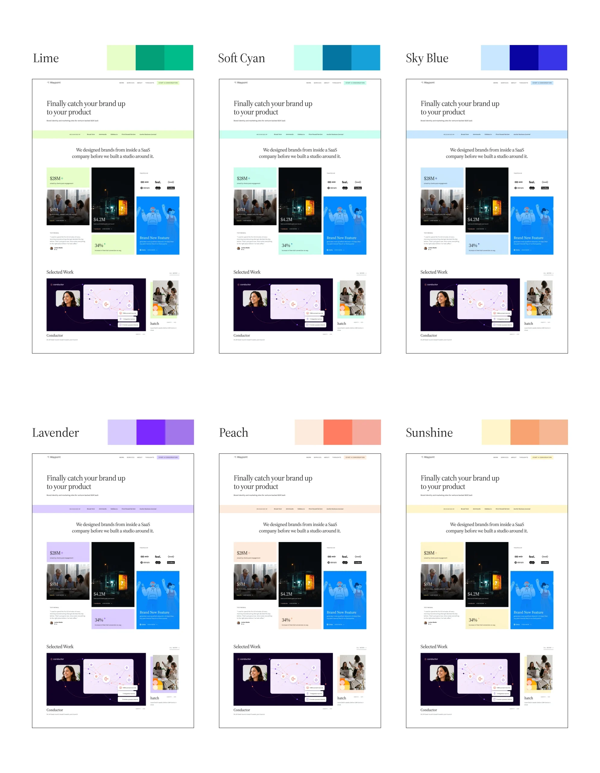
Recommended additional Accent color palettes for this template
| Palette | 1 – Accent | 2 – Accent Alt | 10 – Accent Complement |
| Lime | #E7FEC9 | #04A077 | #00BC8A |
| Soft Cyan | #C9FEEF | #0474A0 | #16A1D8 |
| Sky Blue | #C9E7FE | #0704A0 | #3834E8 |
| Lavender | #D8C9FE | #7B29FF | #A376EC |
| Peach | #FFEBDB | #FF7D63 | #F5AA9B |
| Sunshine | #FEF5C9 | #F8A270 | #F5B794 |
Step 3: Customizing the Block Header
The Waypoint template uses a Block Header, giving you full block-level editing control inside the WordPress editor rather than limiting you to the standard Customizer header rows.
WP Admin -> Kadence -> Header -> Waypoint Primary Header
- Navigate to Kadence > Header in your WordPress admin menu.
- Click on Waypoint Primary Header to open it in the Block Editor.
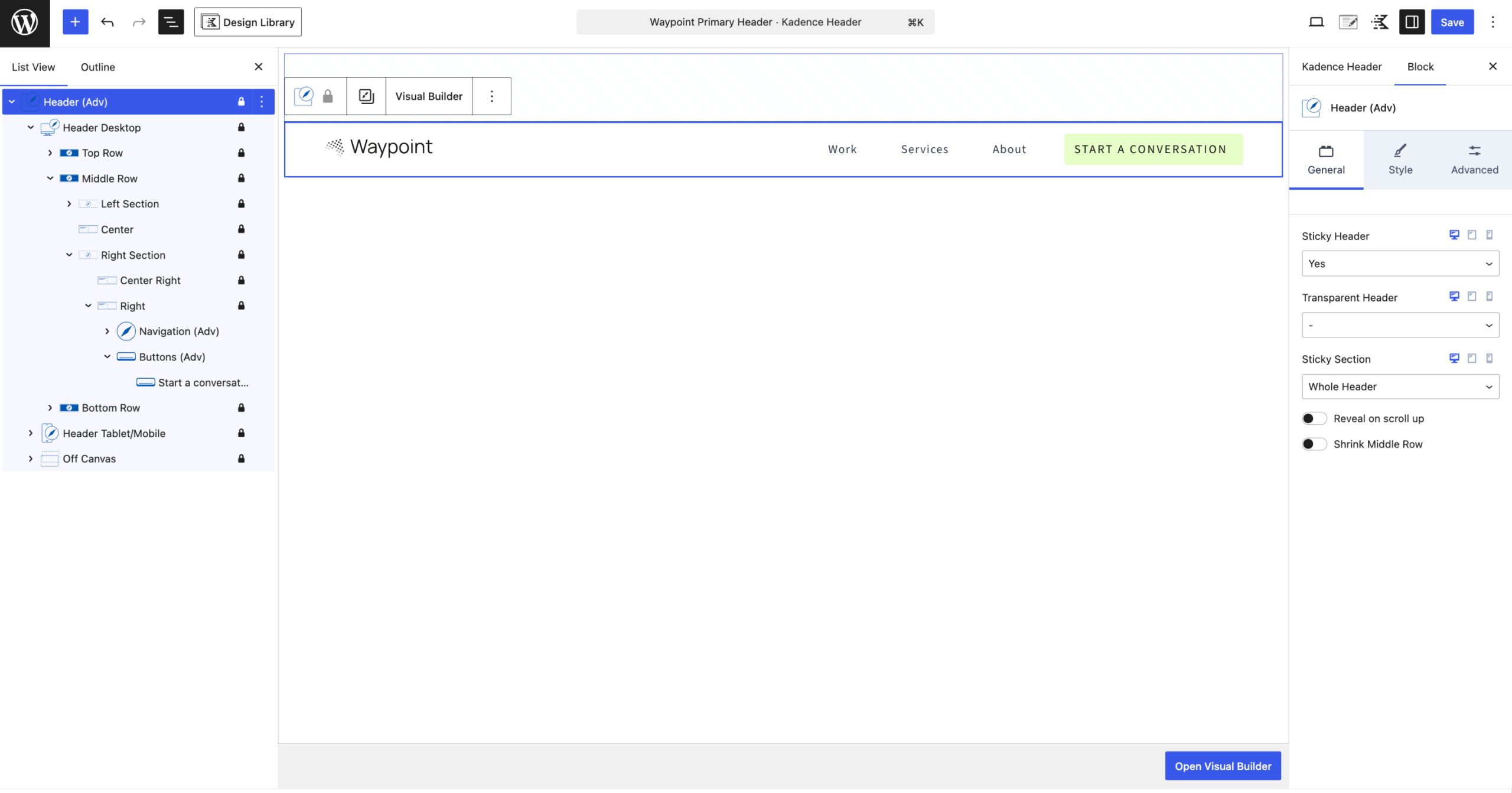
- Open the List View:
- In the top toolbar of the editor, click the List View icon (the three stacked horizontal lines).
- Expanding the List View reveals the complete header hierarchy (Row Layout, Section, Advanced Navigation, Buttons, etc.), making it easy to select specific nested elements or parent containers that aren’t immediately clickable on the canvas.
- Logo & Navigation:
- Click the Site Logo / Image block to upload or replace your brand logo.
- Click the Advanced Navigation block to select your menu items (e.g., Work, Services, About) or add new links directly.
- Call-to-Action (CTA) Button:
- The button next to the menu is an independent Button block. Click it directly in the editor to change the button text, link URL, or styling.
- Sticky & Transparency Settings:
- In the List View, select the main outer row layout: the Header (Adv) container.
- Open the Block Settings sidebar on the right (gear icon) to adjust sticky behavior, header background transparency, and conditional display locations.
Once finished, click Update to save your header changes.
Helpful Guides:
Step 4: Customizing the Footer (Kadence Hooked Elements)
Important Note: This template’s footer is built as a custom Kadence Hooked Element to allow for an advanced, multi-column block layout. Because it is set to replace the default footer, changes made under Appearance > Customize > Footer will not show on your site. All footer edits must be done inside the Hooked Element.
WP Admin -> Appearance -> Kadence -> Elements -> Waypoint Footer
- Go to Appearance > Kadence > Elements from your WordPress dashboard.
- Click on Waypoint Footer to open it in the Block Editor.
- Editing Content & Navigation:
- Open the List View (top left toolbar) to easily navigate nested Row Layout and Section blocks.
- Update placeholder text, copyright notices, and contact information directly on the page canvas.
- In the List View, locate the Advanced Navigation block (found inside the second Row Layout’s second Section) to update your footer menu links.
- Element Settings(paper + pencil icon in the top-right of the editor):
- Placement: Set to Replace Footer.
- Display Settings: Set to Entire Site.
- User Settings: Set to All Users.
- Click Update to apply your changes sitewide.
Ref: Replace the footer
Step 5: Customizing the Archive Layout (Waypoint Archive Template)
All archive pages (such as blog categories, tags, author, and date archives) are controlled by a single Hooked Element named Waypoint Archive Template.
WP Admin -> Appearance -> Kadence -> Elements -> Waypoint Archive Template
The template is organized into two main sections:
1. Hero Section & Breadcrumbs
- Navigation & Breadcrumbs Bar: The top bar uses a horizontal flex layout containing a link to your main work page (WORK), a slash separator (/), and the WordPress Breadcrumbs block.
- Click on the WORK Advanced Heading block to change its link destination or text.
- Select the Breadcrumbs block to adjust spacing, colors, or typography in the right sidebar.
- Dynamic Archive Title (H1): The main heading uses Kadence Dynamic Content mapped to the Archive Title (archive|archive_title). It automatically pulls and displays the title of whichever category or archive page the visitor is viewing.
2. Advanced Query Loop Block
- Post Grid Layout: Located in the second row, the Kadence Query block handles the dynamic list of posts. Select the query container to adjust columns for desktop, tablet, and mobile, gap spacing, and pagination.
- Adding / Removing Dynamic Content: Inside the card layout, you can add, remove, or rearrange dynamic blocks (such as Featured Image, Post Title, Post Meta, Excerpt, or Read More buttons) using the block settings in the right sidebar.
- Inherit Query: Ensure Inherit Query from Template is toggled ON so it automatically serves posts matching the current archive being viewed.
Important Note on Shared Queries: When you edit, add, or remove elements inside this Kadence Advanced Query Loop, your changes will automatically apply to every page across your site where this specific query template is used.
Ref: Query Loop (Adv) Block
3. Element Settings(paper + pencil icon in the top-right of the editor):
- Placement: Set to Replace Archive Content.
- Display Settings: Set to All Archives.
- Click Update to publish your changes across all archive pages.
Step 6: Advanced Layouts, Responsive Visibility & Special Blocks
When editing pages like Home and Services, this template uses several unique design techniques:
1. Responsive Duplicate Sections & The Marquee Block
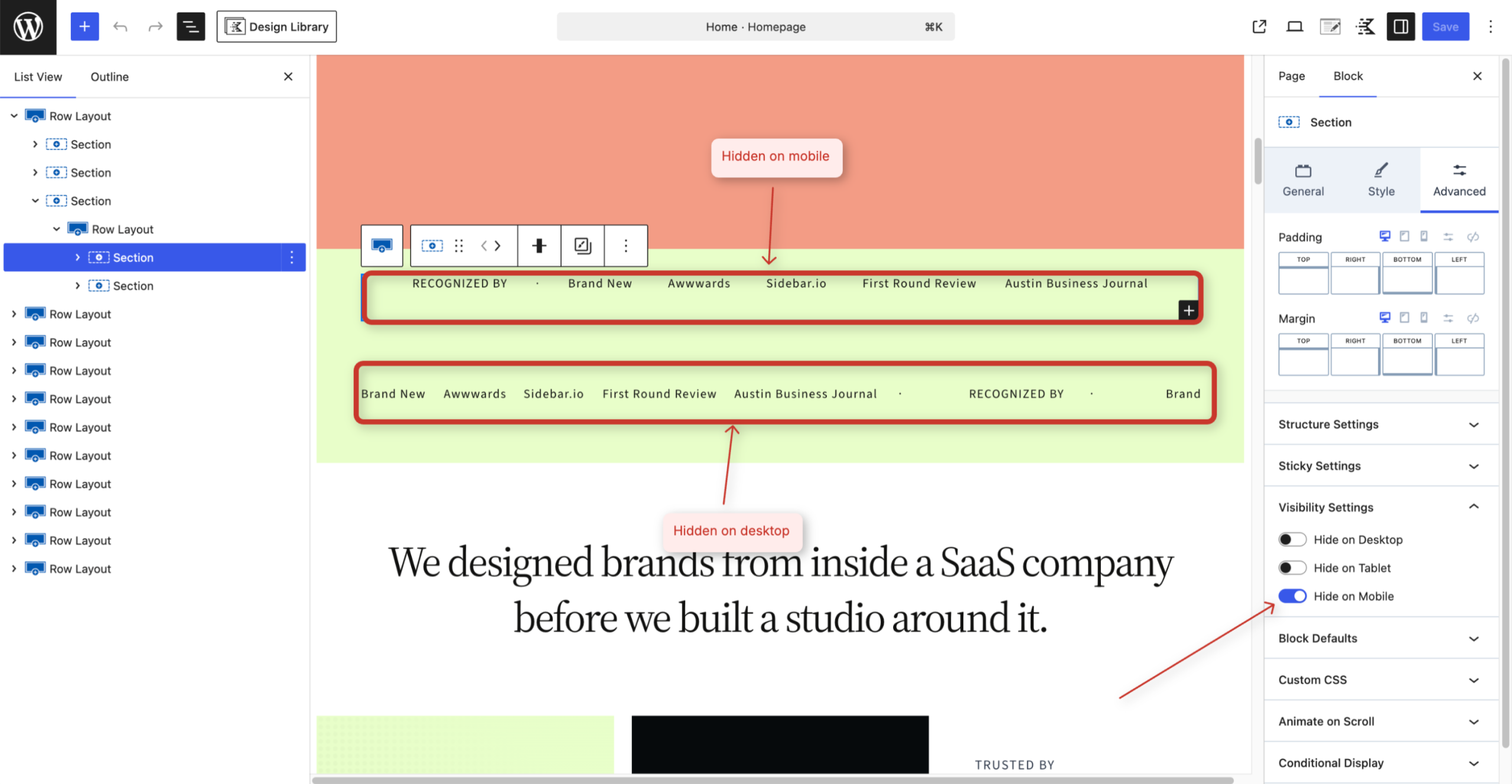
In the Block Editor list view, you may notice two sections stacked together that look almost identical:
- Why there are two sections: One is a static layout designed for Desktop and Tablet screens, while the other uses the animated Marquee Block (smooth scrolling text/logos) optimized for Mobile screens.
- How Visibility is Set:
- Static Section: Configured under Advanced > Visibility Settings to Hide on Mobile.
- Marquee Section: Configured under Advanced > Visibility Settings to Hide on Desktop and Hide on Tablet.
- Customizing Content: When you change text or images in one section, remember to update the corresponding mobile/marquee section so your content stays matching across all devices.
Ref: Marquee (Adv)
2. Device-Specific Background Graphics
- Certain sections use a duplicate section where a background graphic is shown on mobile/tablet viewports but hidden on large desktop screens to keep the desktop design clean.
- You can adjust the graphic or change visibility rules under Row Layout > Advanced (tab) >Visibility Settings.
3. Accordion Hover Effects
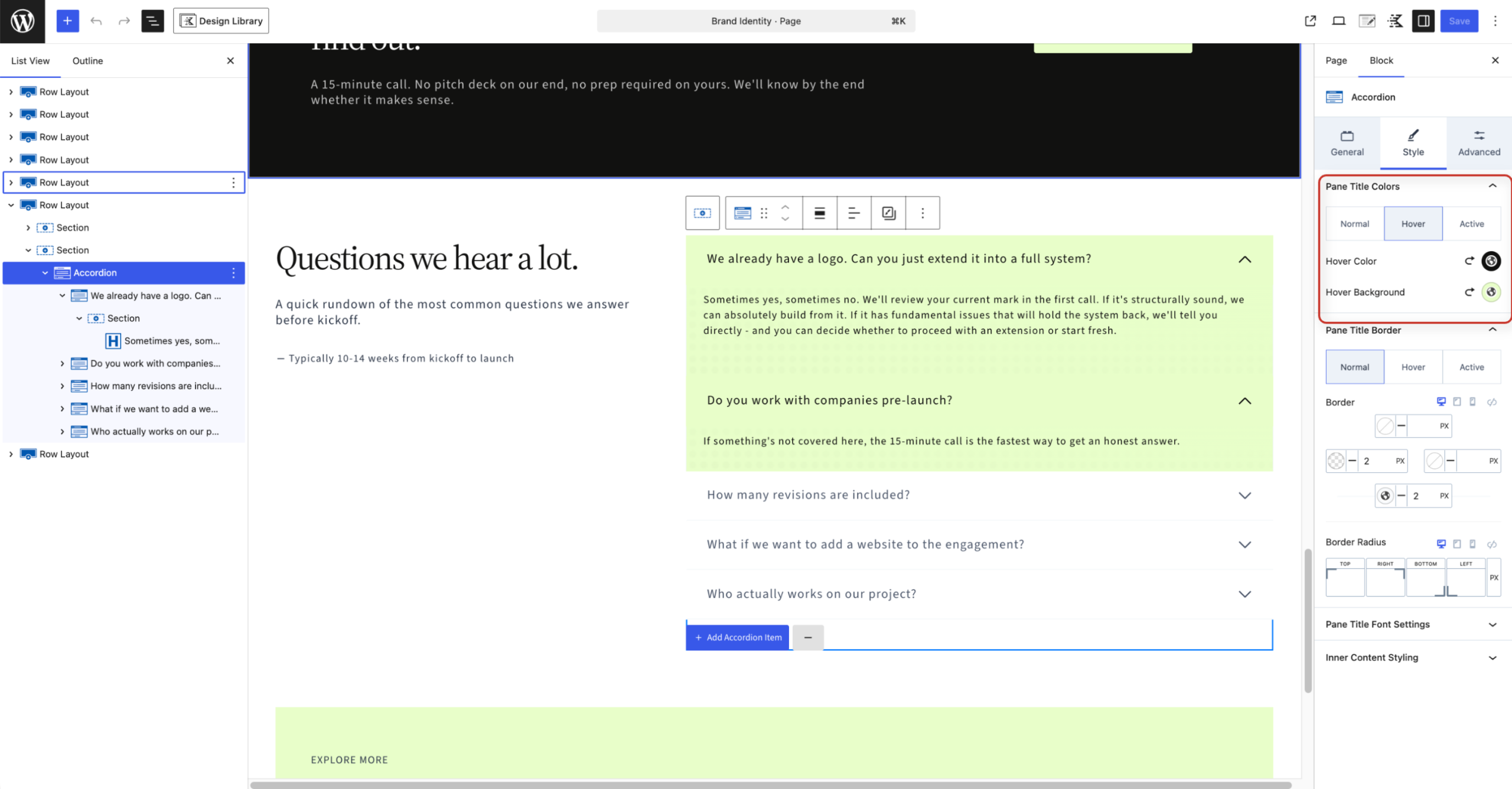
- The FAQ and service accordions feature dynamic border color transitions.
- How it works: In the Accordion Block Settings, the pane title border is set to transparent by default. When a user hovers over it, the border changes to black (or your chosen accent color), and once clicked/active, it matches the background color.
4. Layered “Faux Shadow” Sections & Vector Graphics (Services Page)
- Layered Layout Design: Sections that appear to have offset solid drop shadows are built by nesting two Row Layout / Section blocks:
- The Parent Section sets the background shadow color.
- The Inner Section holds the image and content, positioned with a slight offset to create a clean layered border effect without relying on CSS drop shadows.
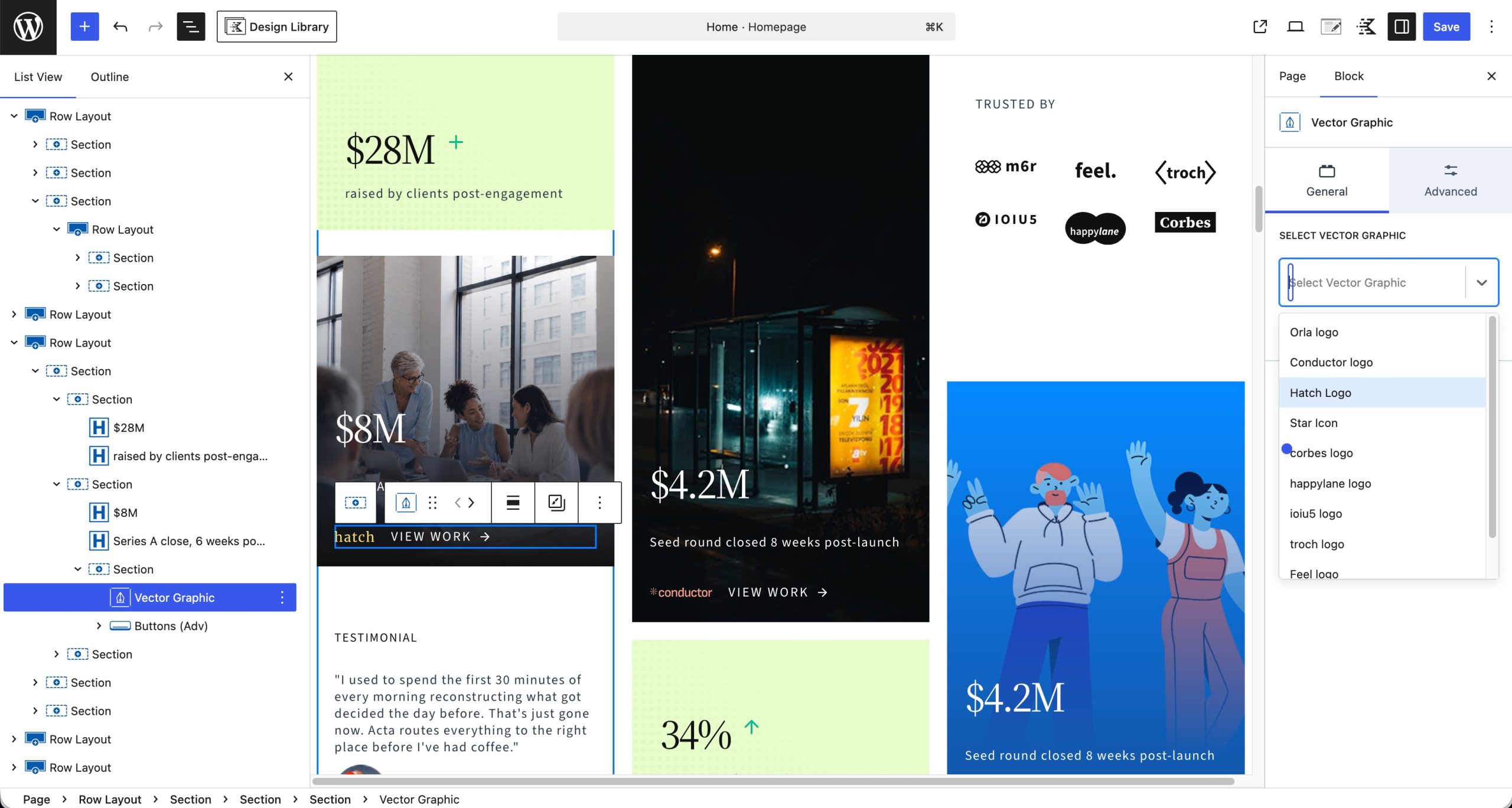
- Vector Graphic Block: Look for the Vector Graphic block inside these sections to easily insert and style sharp SVG icons, brand marks, and custom graphics.
Ref: Vector Graphic Block Documentation
Step 7: Portfolio Posts Setup
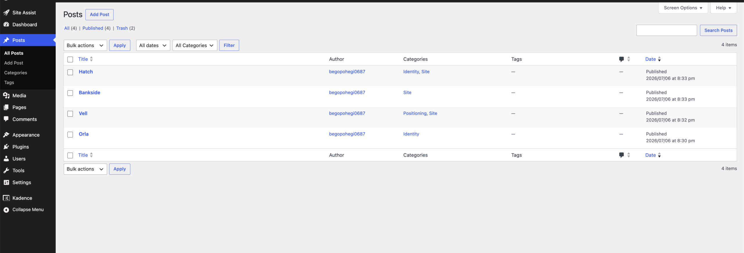
In the Waypoint template, portfolio projects and case studies are built as standard WordPress Posts. This lets you easily categorize projects, filter them, and display them in dynamic grids using the Advanced Query Loop.
WP Admin -> Posts -> All Posts
- Full Showcase Post (“Hatch”): The post titled “Hatch” is a fully built case study layout showing how images, project briefs, dynamic headings, and testimonials fit together.
- Starter / Reference Posts: The remaining imported posts provide clean starter layouts you can use as templates when adding your own work.
- Categories & Filters: Assign categories (such as Branding, Web Design, or Development) to each post under the Post Settings sidebar. These categories automatically power your archive pages and grid filters.
Step 8: Identifying & Editing Custom CSS (CSS Indicator Feature)
Some unique design elements use block-level custom CSS (for example, link hover interactions and setting full viewport height 100vh on the Contact page image).
Select Block -> Right Sidebar Settings -> Advanced -> Custom CSS
- How to Spot Custom CSS: When editing any page in the Block Editor, Kadence Blocks Pro displays a small Custom CSS indicator icon directly next to any element that has custom code applied to it.
- Editing the Code:
- Click the block showing the Custom CSS indicator.
- In the right sidebar, expand the Advanced tab.
- Scroll down to the Custom CSS field to view, update, or remove the snippet.

Ref: Kadence Block Controls Guide
Step 9: Configuring Conditional Display Rules
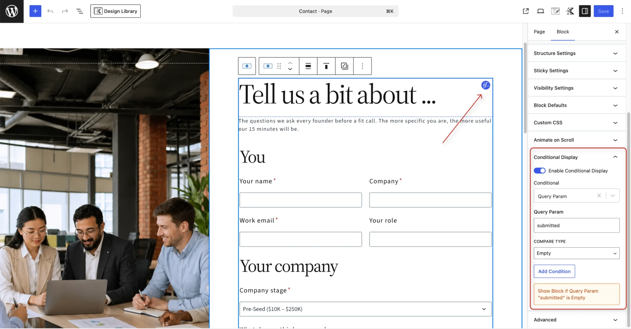
Conditional Display allows you to show or hide individual blocks or sections based on specific rules, user roles, dates, or URL parameters.
Select Block -> Right Sidebar Settings -> Block Controls / Advanced -> Conditional Display
1. How to Spot Conditional Display (The “if” Indicator)
When editing a page or layout in the Block Editor, if you see a small bubble/badge with if overlaid on a block or section, it indicates that Conditional Display rules are active on that element.
2. How Conditional Display Works (Example: Form Query Parameter)
In this template, sections like contact forms or confirmation messages use Query Parameter conditions:
- The Rule Setup:
- Condition Type: Query Parameter
- Parameter Name: submitted
- Compare Type: is empty
- How it Operates:
- If the URL parameter submitted is empty (the visitor has not submitted the form yet), the form section displays normally.
- Once the form is submitted and the URL appends ?submitted=true (or the parameter is no longer empty), the block automatically hides itself, allowing a success message or confirmation section to display instead.