

Kadence Blocks
How to Use the Kadence Style Library
The Kadence Style Library is where you set up the design system for Kadence Blocks in one place. You decide which colors, text sizes, border radius, border thickness, spacing, icon sizes, and more are used within Kadence Blocks. Every Kadence block that uses those values picks them up automatically, and when you change a value later, every block using it updates across your site.
You can also save complete block styles as presets. A preset is a saved look for a block, such as a Button or a heading, that you can apply with one click instead of setting each option by hand.
This guide covers:
- What the Style Library is and how it works
- How to open it and find your way around
- How to set up each Base Style (colors, typography, border radius, border width, spacing, icon sizes, and shadows)
- How to create and use Block Presets
- How to use Style Library values inside the block editor
- What happens to your existing content
Before You Begin
Requirements
- Kadence Blocks plugin updated to the release that includes the Style Library (version 3.7.12).
Known Issue: Theme Button Colors May Change After Updating
Important: If you use the Kadence Theme, updating Kadence Blocks to this release can overwrite the button colors and styles you set in the Customizer, replacing them with the default preset colors. We are aware of this issue and a fix is planned for a future update.
Before you update:
- Go to Appearance > Customize and note down your current button colors and styles (or take a screenshot of the settings).
- Take a full backup of your site.
After you update:
- Check the buttons on your site.
- If they changed, set your button colors again. You can do this in the Customizer, or by setting the Button and Button Hover colors in the Style Library Color Palette
What is the Kadence Style Library
Kadence already gives you sitewide control of colors, typography, and spacing through the theme. The Style Library extends that same central control to the styling settings inside Kadence Blocks.
Note: The Style Library only works with Kadence Blocks. It does not apply to other Gutenberg blocks, such as the core WordPress blocks (Paragraph, Heading, Button, Image, and so on) or blocks from other plugins. Style Library tokens and presets are only available in the settings of supported Kadence blocks.
Tokens
Each value you save in the Style Library is a token. A token is a named value, such as a color called Button or a spacing step called Medium.
When you choose a token on a block, the block remembers the token name, not just the value. If you later change what the token is set to, every block using that token updates across your site. You do not need to open each page and edit each block.
Example: Your site has 40 buttons that use the Button color token. You change the Button color from blue to red in the Style Library. All 40 buttons using the same token turn red.
Custom values are not linked
You can still type or pick your own value on any block. This is called a custom value. Custom values are not linked to the Style Library, so changing a token does not change them.
Example: You picked a specific green for one button using the color picker. When you change the Button color token to red, that one button stays green, because you chose that green by hand.
Use tokens when you want a block to follow your site’s design system. Use a custom value when you want a one off style that should never change with the rest of the site.
Your existing website will not change
The Style Library is designed so that your site looks the same after you update Kadence Blocks. The default tokens and default presets match how Kadence Blocks styled content before this release. You can start using the Style Library at your own pace.
If you use the Kadence Theme, your existing theme color palette is imported into the Style Library as your Default palette when you update Kadence Blocks. Your colors carry over, so blocks that use your palette colors keep looking the same. From then on, you manage your color palette in the Style Library instead of the theme’s color palette settings. This import only happens on sites that use the Kadence Theme.
How a block decides which style to use
For each setting, a block checks three layers in this order:
- The block. If you set a value directly on the block, that value is used.
- The block preset. If the block has no value of its own for that setting, it uses the value from its preset.
- The theme. If neither the block nor the preset has a value, the theme default is used.
The preset sits between the theme and the block. This lets you mix and match. A block can take most of its styles from its preset while you change one or two settings on that block only.
Style Library vs. Design Library
The block editor toolbar has a button called Design Library. That is Kadence’s library of ready-made patterns and page layouts. It is a different feature. The Style Library holds your site’s design values and block presets, and you open it from the WordPress dashboard.
Opening the Style Library
- Log in to your WordPress dashboard.
- In the left menu, go to Kadence > Style Library.
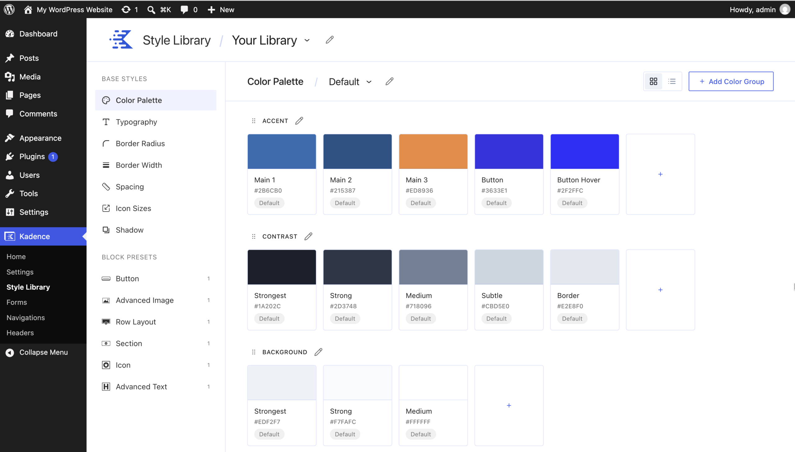
The Style Library opens on the Color Palette screen.
Finding your way around
Header
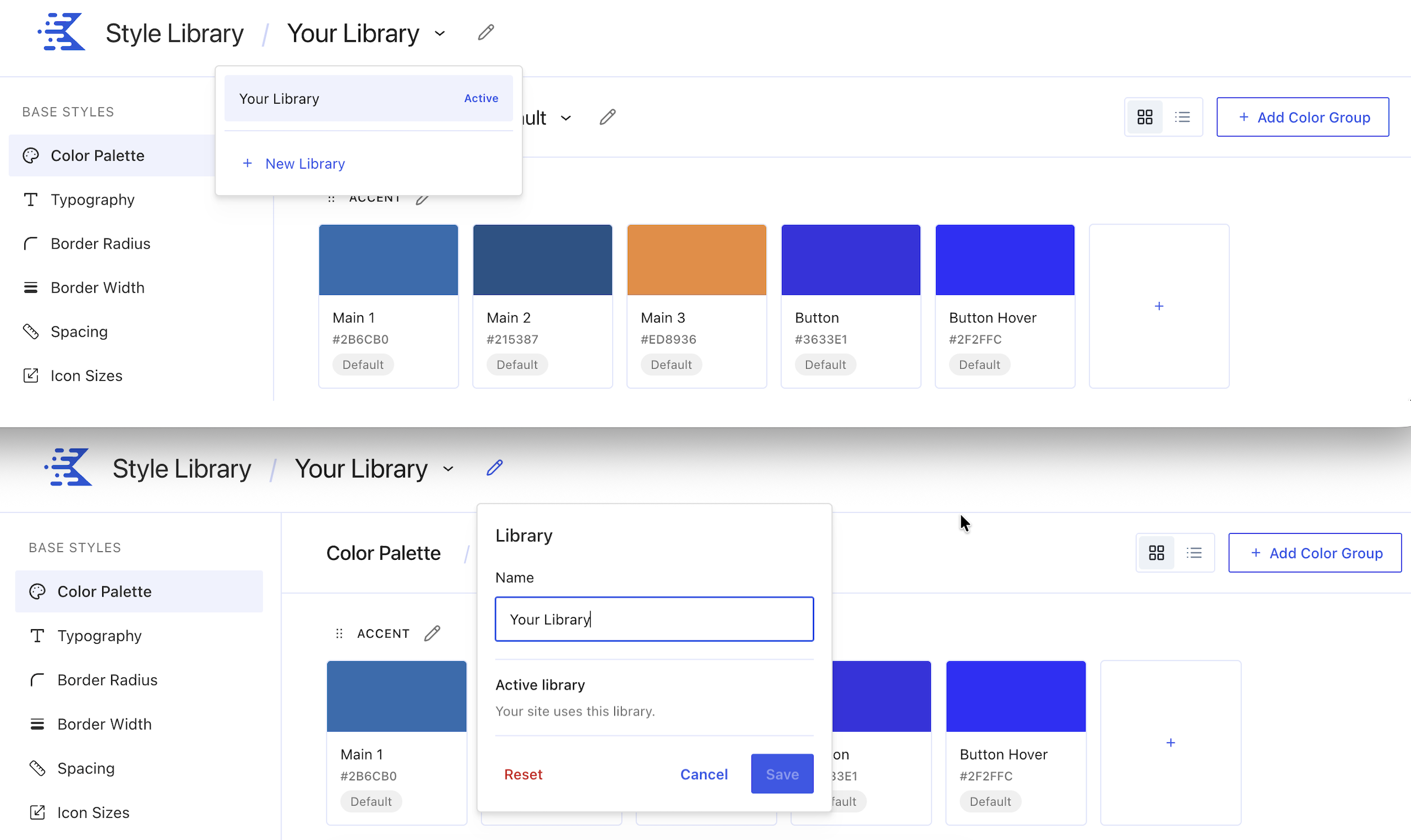
- The header shows Style Library / Your Library. “Your Library” is the name of the library your site uses.
- Click the arrow next to the library name to see your libraries. The library your site uses is marked Active. You will also see New Library, where you can add additional libraries to the website.
- Click the pencil icon next to the library name to open the Library panel. Here you can change the library Name. The panel also confirms the active library your site uses.
Caution: The Library panel also has a Reset button. Resetting the library returns your Style Library settings to their defaults. Only use it if you want to start over.
Left sidebar
The sidebar has two sections:
- Base Styles: Color Palette, Typography, Border Radius, Border Width, Spacing, Icon Sizes, and Shadow.
- Block Presets: Button, Advanced Image, Row Layout, Section, Icon, and Advanced Text. The number next to each block shows how many presets that block has.
Main area
Each screen has a short description at the top and a Learn more link. Buttons such as Add Color Group or Add Spacing appear at the top right.
Base Styles
What are Base Styles
Base Styles are the building blocks of your design system. They are the tokens your blocks and presets choose from:
| Base Style | What it controls |
|---|---|
| Color Palette | The colors your site uses |
| Typography | Your text sizes, plus a list of favorite fonts |
| Border Radius | How rounded corners are |
| Border Width | How thick borders are |
| Spacing | Padding and margin steps |
| Icon Sizes | How large icons are |
| Shadow | Shadow styles that add depth |
Working with Base Style tokens
All Base Style screens work in a similar way:
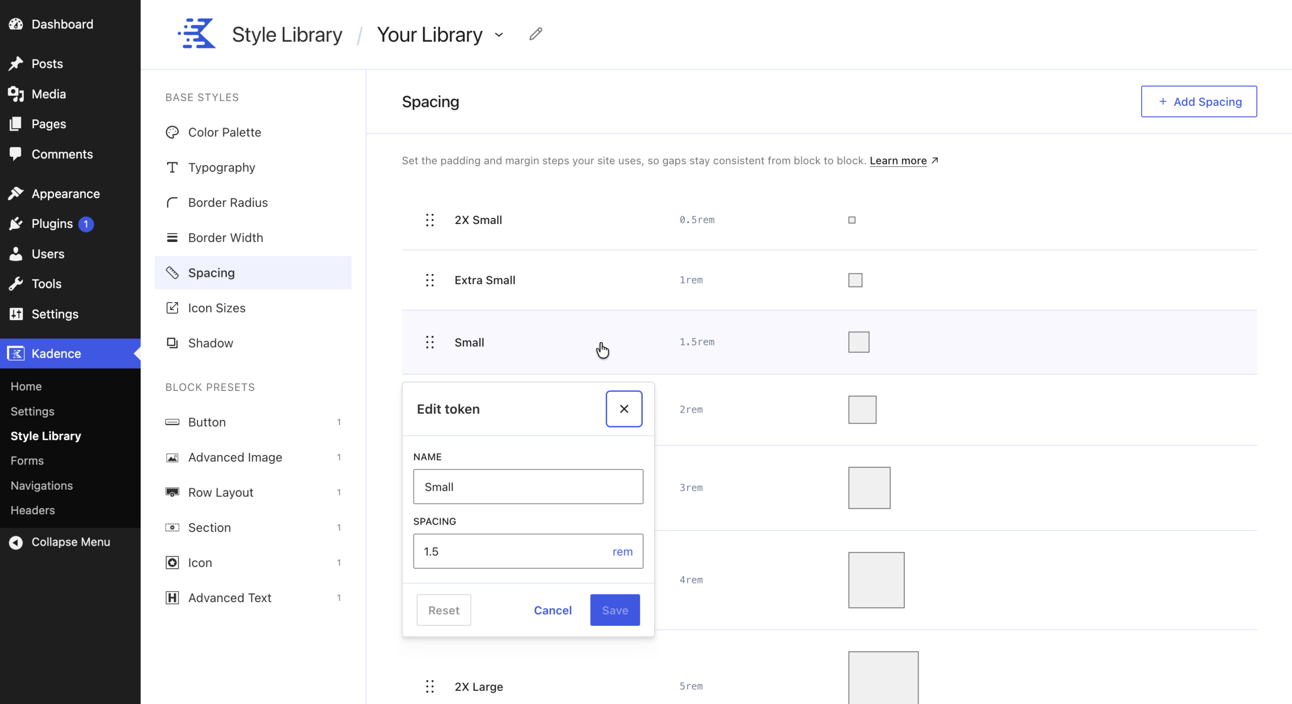
- Edit a token: Click the token. A panel opens where you can change its Name and value.
- Save or cancel: Click Save to keep your change, Cancel to close without saving, or Reset to return the token to its default value.
- Add a token: Use the Add button at the top right of the screen (for example, Add Spacing).
- Reorder tokens: Drag a token by its drag handle (the six dots on the left) to move it.
Tip: Rename a token only if you need to. The name is what you see when you choose the token in the block editor, so clear names such as “Small” and “Large” make it easier to pick the right one.
Color Palette
The Color Palette holds the colors your site uses. Change a color here and it updates everywhere that color is applied.
Your theme colors are imported automatically
If you use the Kadence Theme and already have a color palette set up (in Appearance > Customize > Colors & Fonts > Colors), that palette is imported into the Style Library as your Default palette when you update Kadence Blocks. You do not need to enter your colors again.
Note: This import only works on sites that use the Kadence Theme. If you use a different theme, your palette starts with the default colors listed below.
After you update, open Kadence > Style Library > Color Palette to review your imported colors.
Important: After the update, you manage your color palette in Kadence > Style Library > Color Palette, not in the theme’s color palette settings in the Customizer. To add, change, or remove a palette color, use the Style Library.
Default colors
If you do not use the Kadence Theme, or you have no existing Kadence Theme color palette, your palette starts with four color groups:
| Group | Color | Default value |
|---|---|---|
| Accent | Main 1 | #2B6CB0 |
| Accent | Main 2 | #215387 |
| Accent | Main 3 | #ED8936 |
| Accent | Button | #3633E1 |
| Accent | Button Hover | #2F2FFC |
| Contrast | Strongest | #1A202C |
| Contrast | Strong | #2D3748 |
| Contrast | Medium | #718096 |
| Contrast | Subtle | #CBD5E0 |
| Contrast | Border | #E2E8F0 |
| Background | Strongest | #EDF2F7 |
| Background | Strong | #F7FAFC |
| Background | Medium | #FFFFFF |
| Notices and Feedback | Success | #38A169 |
| Notices and Feedback | Warning | #DD6B20 |
| Notices and Feedback | Error | #E53E3E |
| Notices and Feedback | Info | #3182CE |
About the Button colors: Button is the default background color of Kadence buttons, and Button Hover is the background color when a visitor hovers over them. Change these two colors to restyle every default button on your site at once.
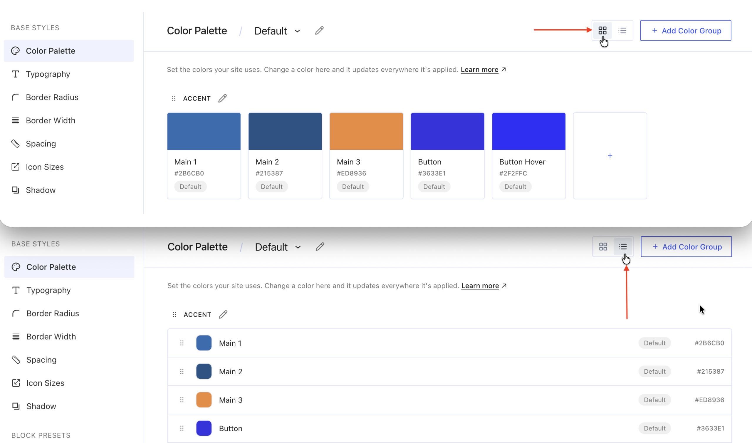
Grid view and list view
Use the two icons at the top right to switch views:
- Grid view shows each color as a large swatch.
- List view shows one row per color with its hex value.
Edit a color
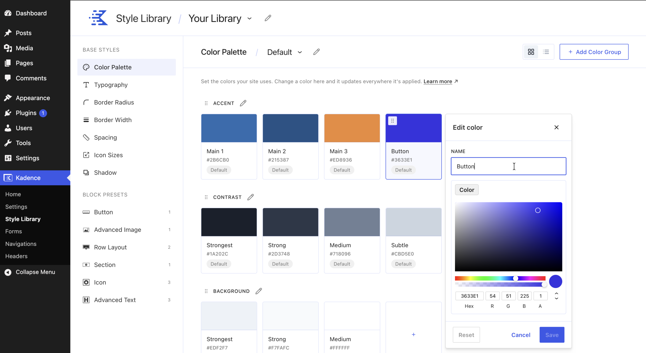
- Go to Kadence > Style Library > Color Palette.
- Click the color you want to change.
- In the Edit color panel, change the Name if you want to.
- Choose a new color with the color picker, or type a value in the Hex, R, G, B, or A (opacity) fields.
- Click Save.
To undo your changes before saving, click Cancel. To return the color to its default value, click Reset.
Add a color
- Click the + tile at the end of the color group.
- Enter a name and choose a color.
- Click Save.
Add, rename, or reorder a color group
- Add a group: Click Add Color Group at the top right.
- Rename a group: Click the pencil icon next to the group name.
- Reorder groups: Drag a group by its drag handle.
Example: Change the color of every default button
- Go to Kadence > Style Library > Color Palette.
- Click the Button color.
- Choose your new color and click Save.
- Open or reload any page. Every button using the default style now shows the new color.
Buttons where you picked a custom background color keep their custom color. The hover color stays the same until you also change Button Hover.
Multiple color palettes
You can create more than one color palette. This is useful when parts of your site need different colors. For example, buttons placed on dark backgrounds might need a lighter color so they stand out.
Create a palette
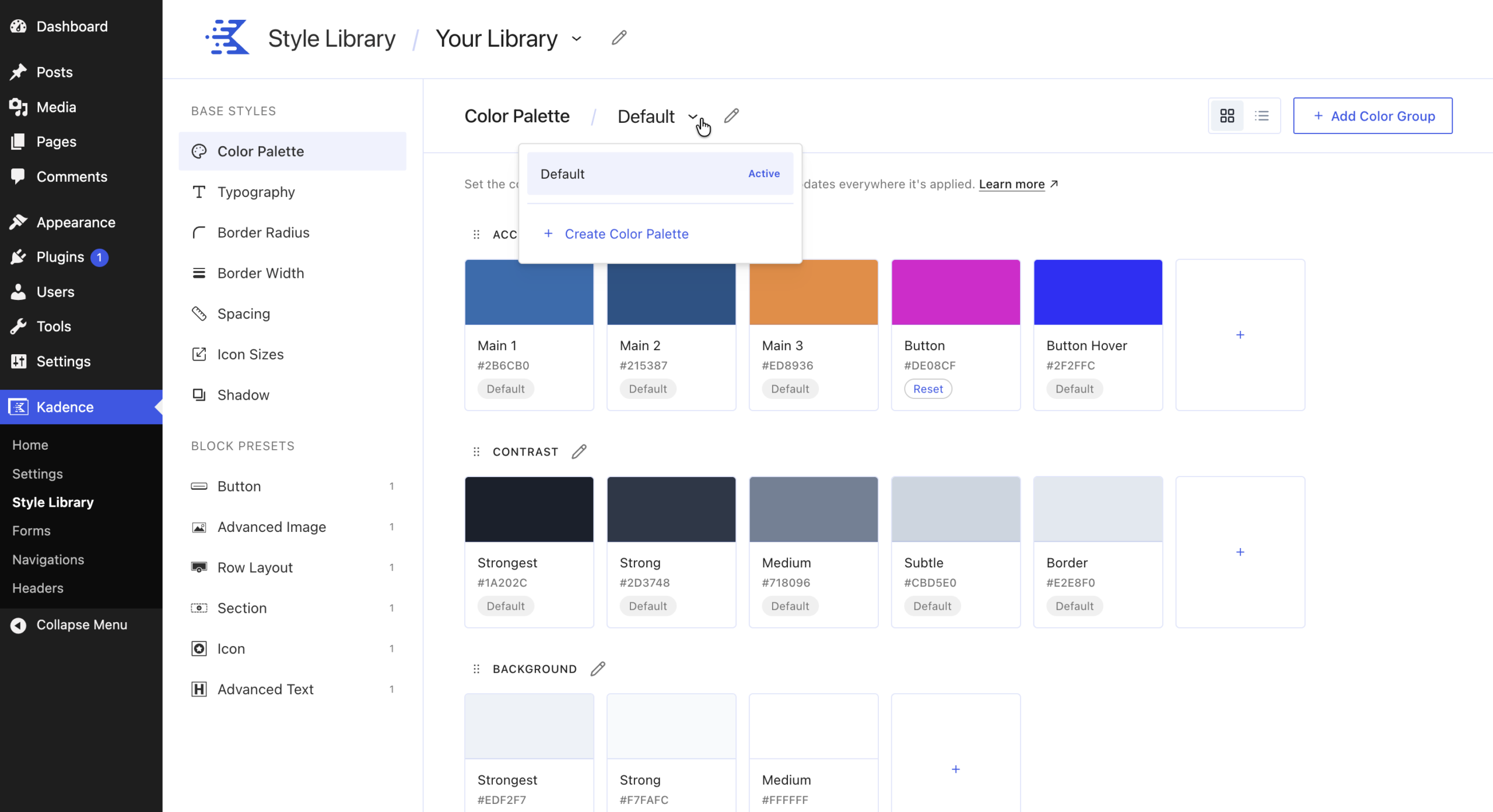
- On the Color Palette screen, click the palette menu next to the page title (it shows Default).
- Click Create Color Palette.
- Enter a Palette Name (for example, “Dark Backgrounds”) and click Create.
- Change only the colors that should be different in this palette, and save each one.
How new palettes work
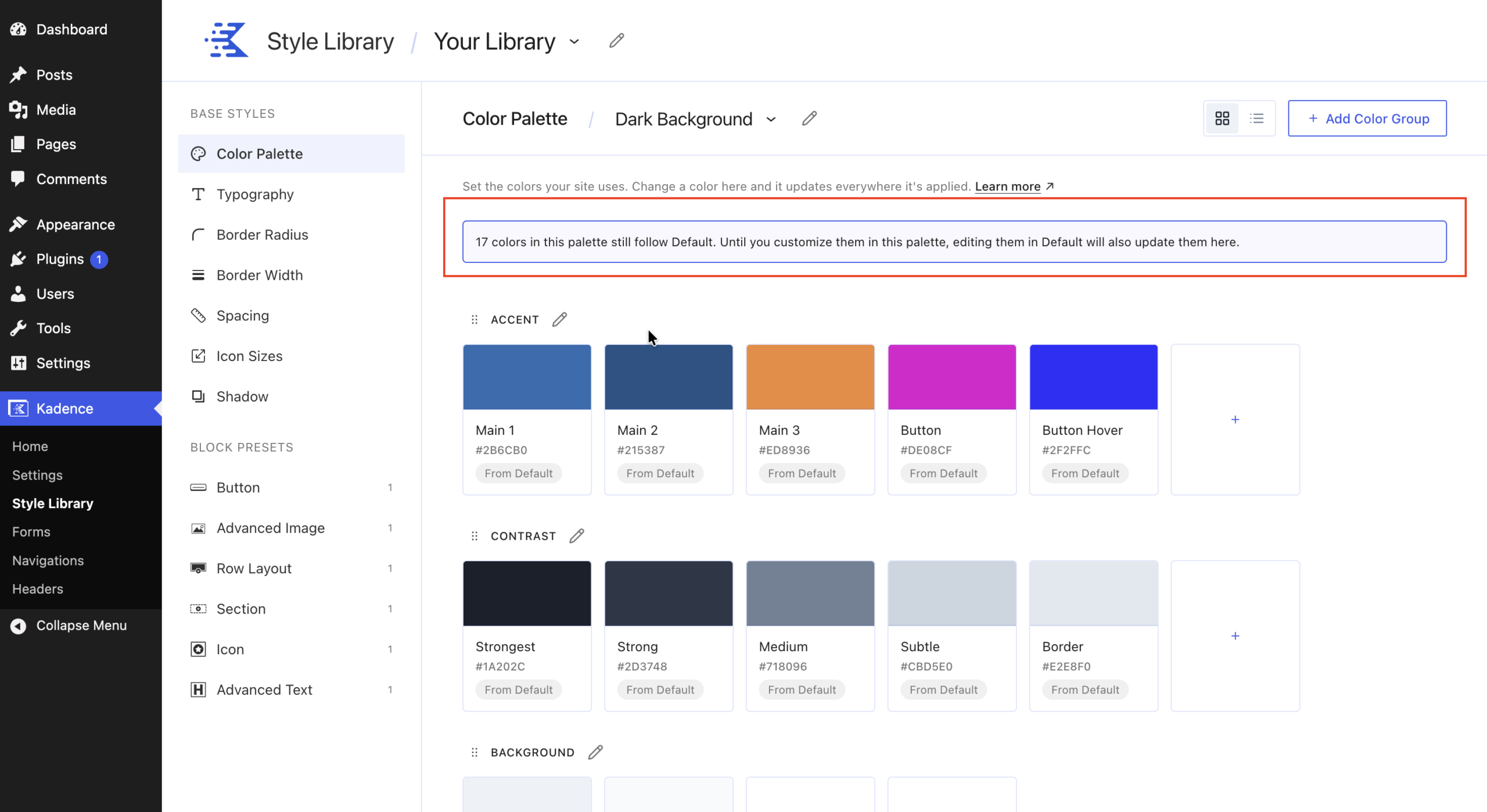
A new palette starts as a copy of the Default palette. Every color keeps using the Default palette’s value until you change it in the new palette. For example, if your “Dark Backgrounds” palette only changes Button to yellow, Button Hover still uses the Default palette’s color.
Rename a palette or check which one is active
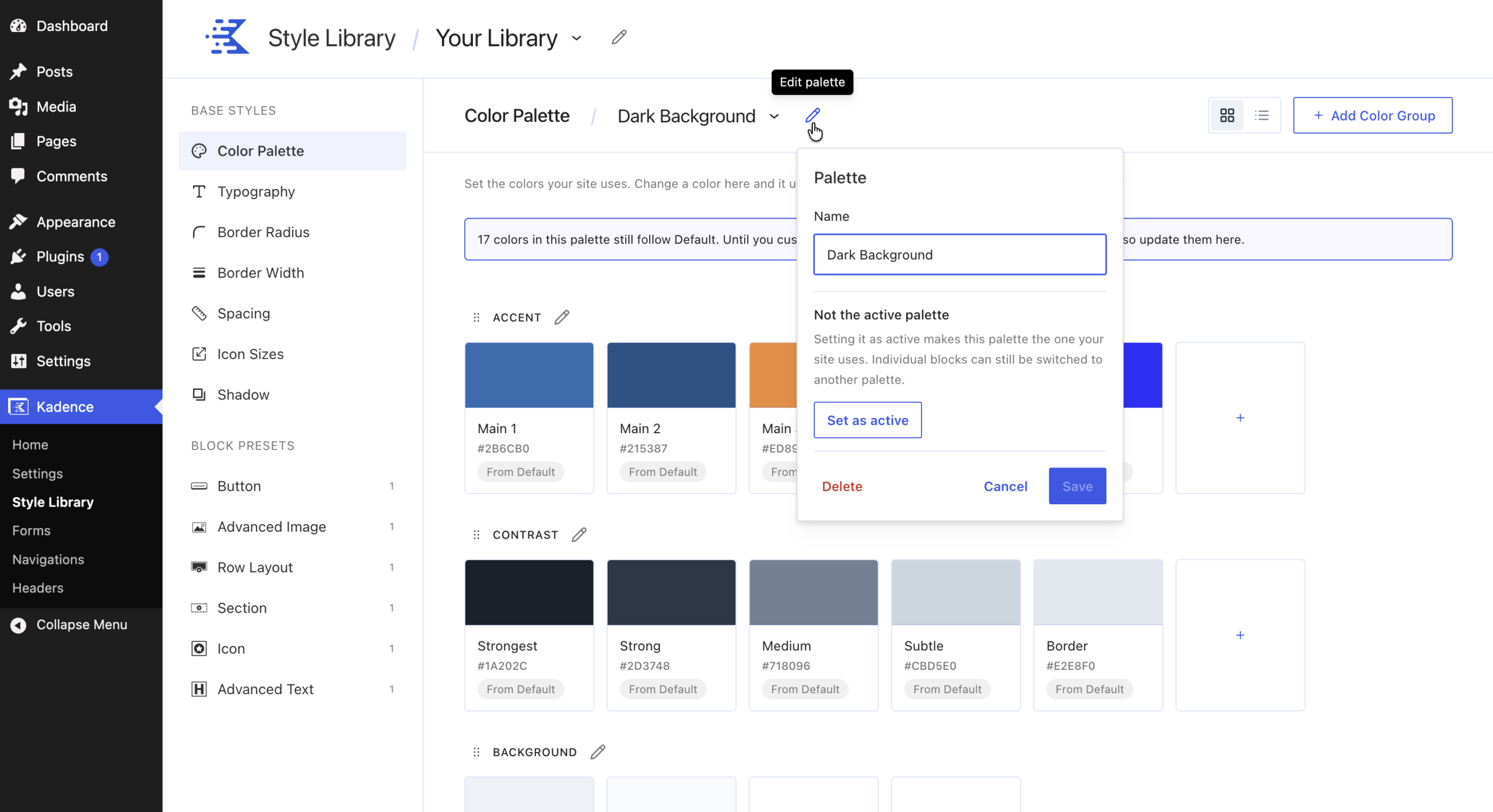
Click the pencil icon next to the palette name. The Palette panel shows the palette name and, if it is the palette your site uses, Active palette: Your site uses this palette.
Use a different palette on one block
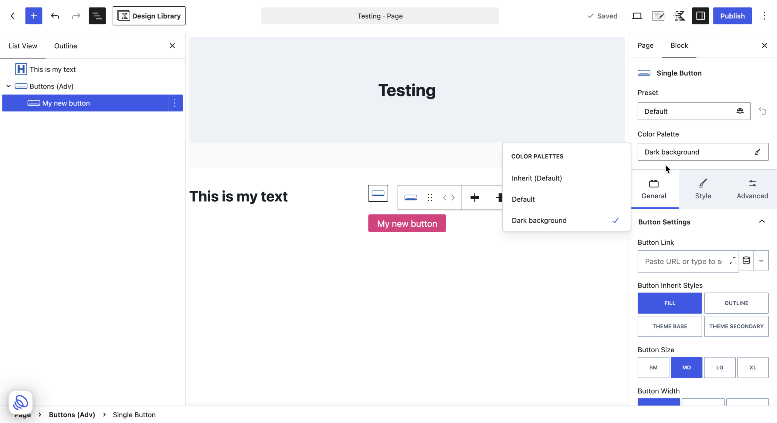
When your site has more than one palette, a palette option appears in the block settings in the editor.
- Open a page in the block editor.
- Select the Kadence block.
- In the block settings, choose the palette the block should use.
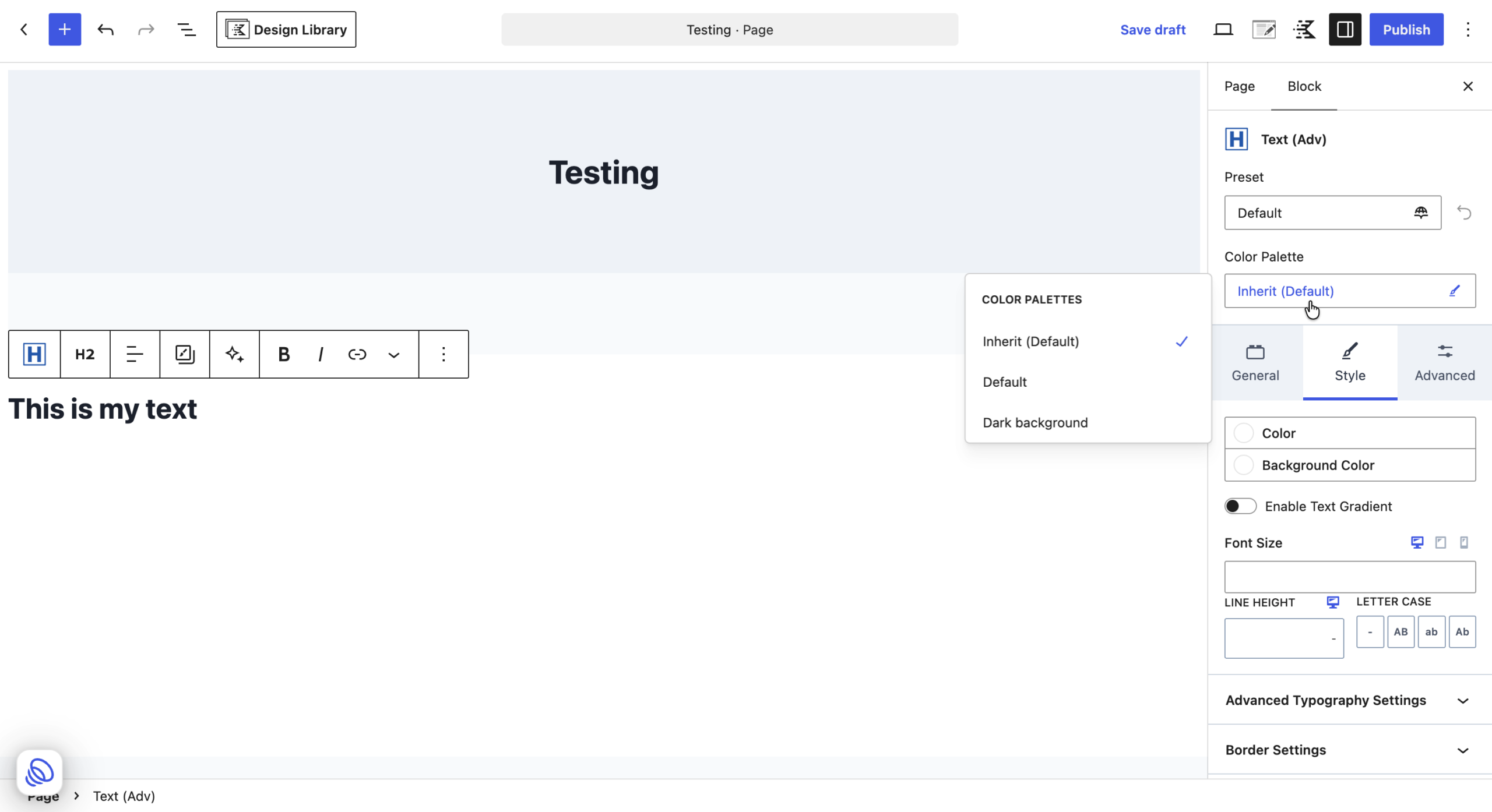
Every color on that block that uses a palette token (such as the button background) switches to the matching color from the palette you chose. You will see the change in the editor right away and on your live site after you update the page.
Note: If the editor was already open when you created your second palette, reload the editor page to see the palette option.
Change the palette for your whole site
You can make a different palette the active palette for your entire site. Every block then uses it, except blocks where you chose a specific palette. This is a handy way to test or roll out a new brand look in stages.
Deleting a palette
If a block uses a palette that is later deleted, the block goes back to using the Default palette.
Typography
Typography holds the text sizes your site uses, and a list of favorite fonts you want close at hand.
Default text sizes
| Name | Default Size |
|---|---|
| Small | 0.9rem |
| Medium | 1.25rem |
| Large | 2rem |
| Extra Large | 3rem |
| 2X Large | 4rem |
| 3X Large | 6rem |
These sizes match the named text sizes Kadence Blocks already used. Blocks that already use one of those named sizes are linked to the matching token automatically, so you can adjust them from here.
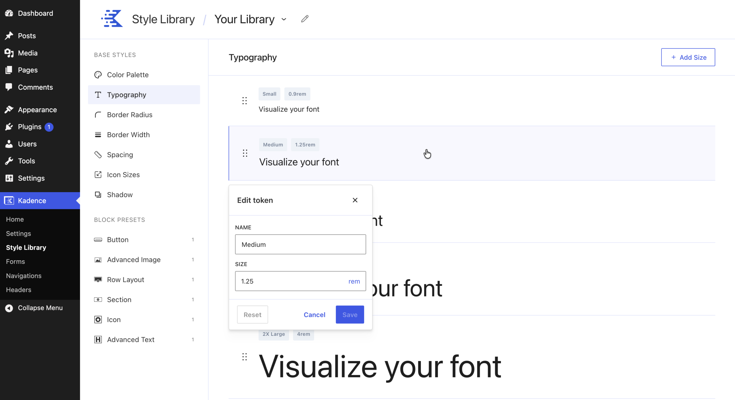
Edit a text size
- Go to Kadence > Style Library > Typography.
- Click the size you want to change.
- In the Edit token panel, change the Name or Size.
- Click Save.
To add a new size, click Add Size.
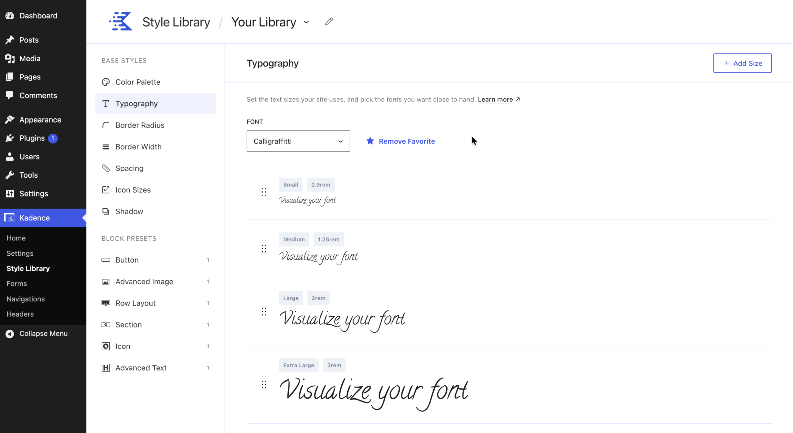
Preview a font and add it to your favorites
- Choose a font from the Font menu at the top of the Typography screen. Each size row shows the sample text “Visualize your font” in that font, so you can see how it looks at every size.
- Click Add Favorite to save the font to your favorites.
When you edit a block or a preset, your favorite fonts appear in a Favorites tab in the font picker. You can choose them quickly instead of searching through the full list of Google Fonts.
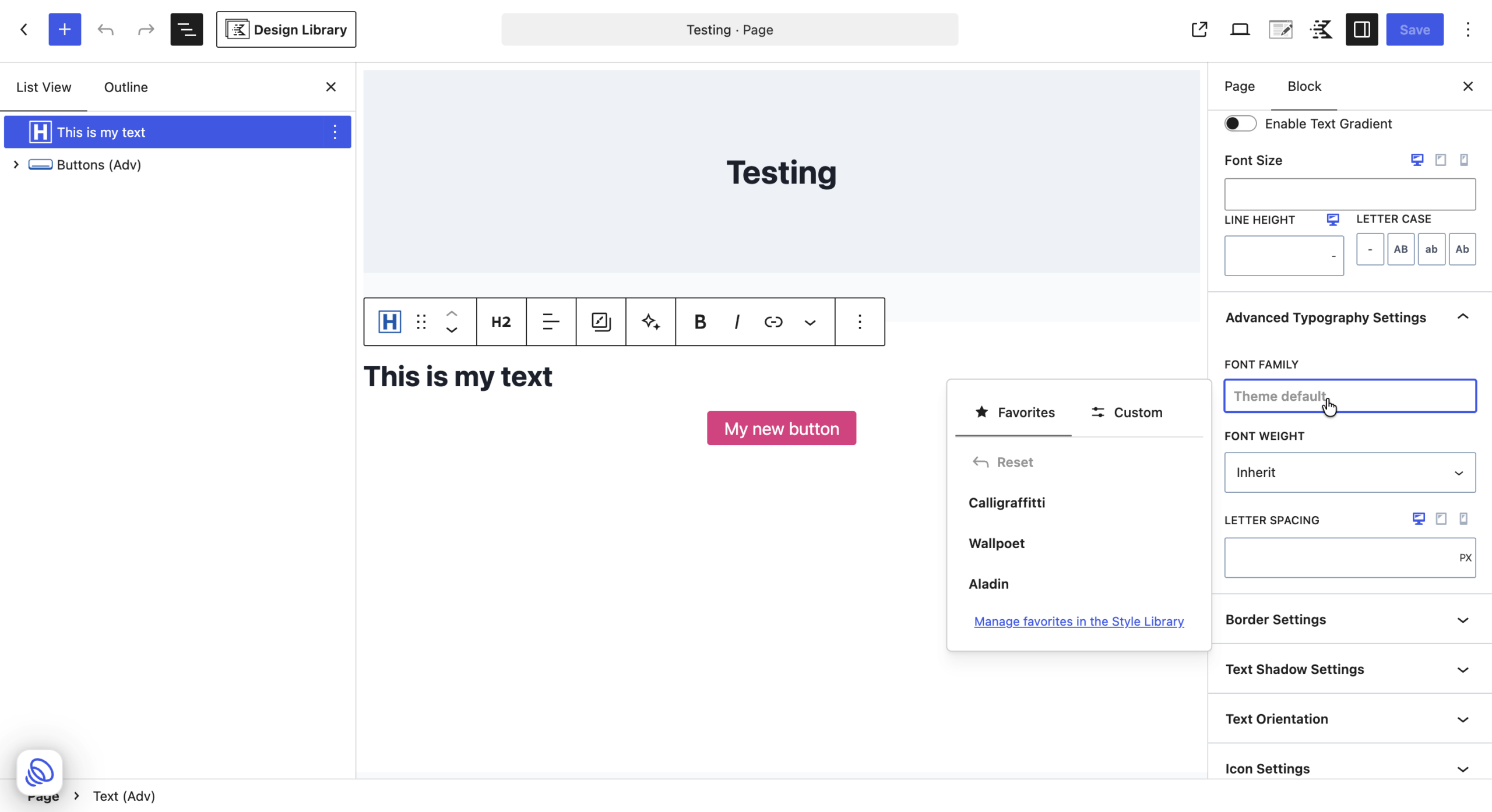
Note: Fonts are not tokens. The Style Library stores tokens for text sizes, not for font families. The font family is saved on the block or the preset where you choose it.
Border Radius
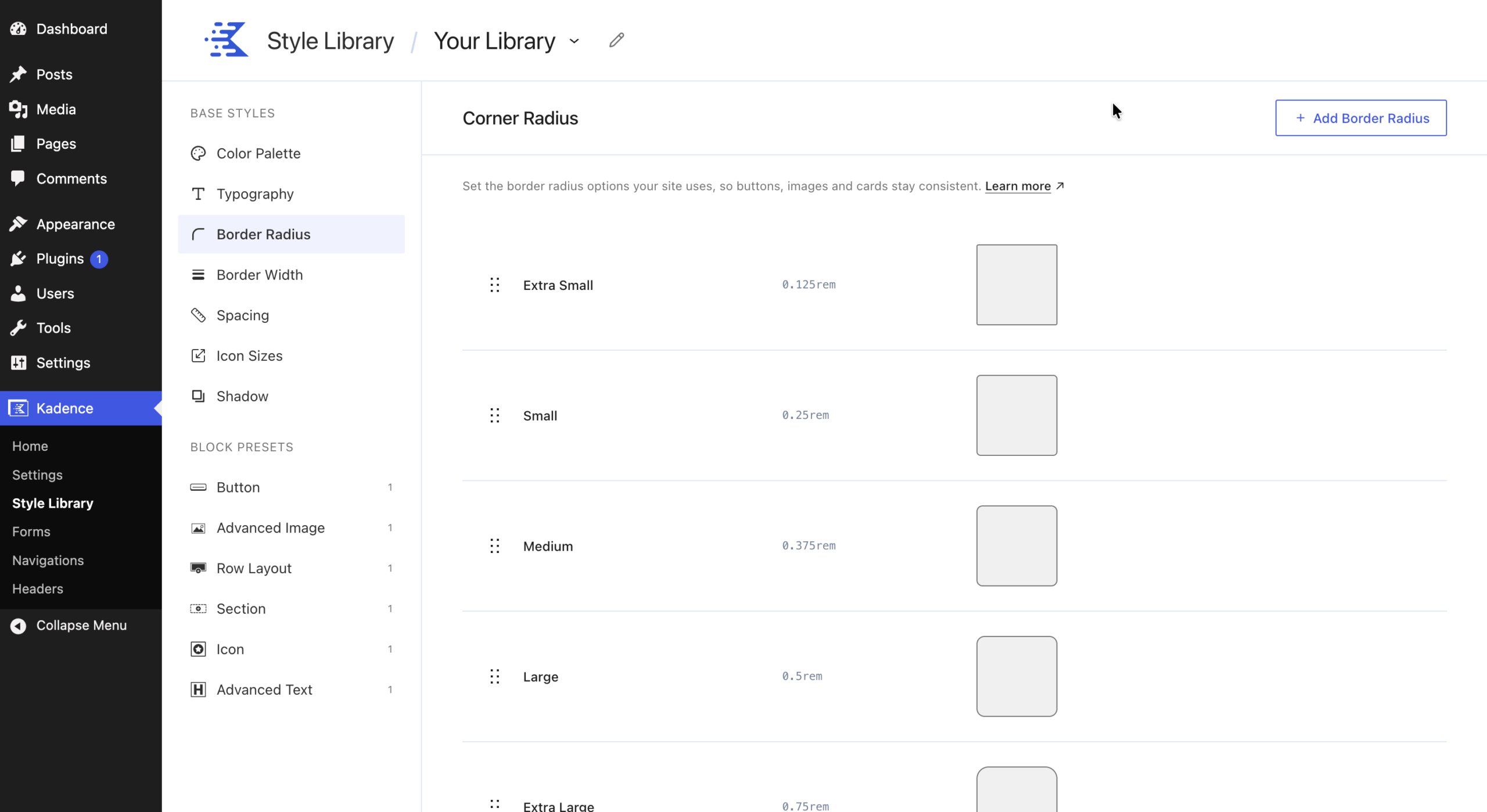
Border Radius sets how rounded corners are, so buttons, images, and other elements stay consistent. On this screen the page heading reads Corner Radius.
| Name | Default Value |
|---|---|
| Extra Small | 0.125rem |
| Small | 0.25rem |
| Medium | 0.375rem |
| Large | 0.5rem |
| Extra Large | 0.75rem |
| 2X Large | 1rem |
| 3X Large | 1.5rem |
| Full | 9999px |
Each row shows a preview square with that rounding. Full makes fully rounded, pill shaped corners.
- To change a radius, click it, update the value, and click Save.
- To add one, click Add Border Radius.
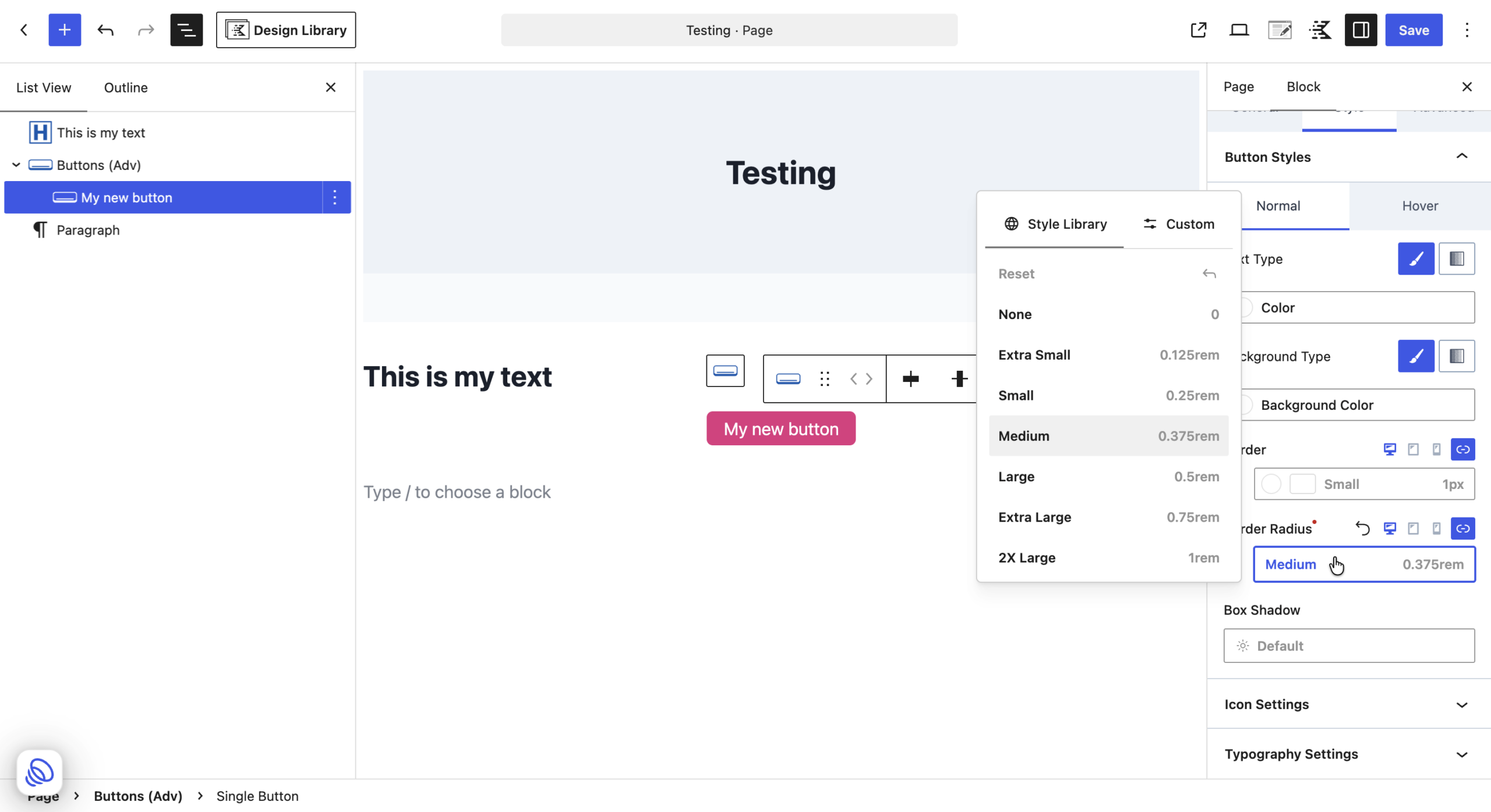
- In the editor, you can select your preferred border radius from the style library
Border Width
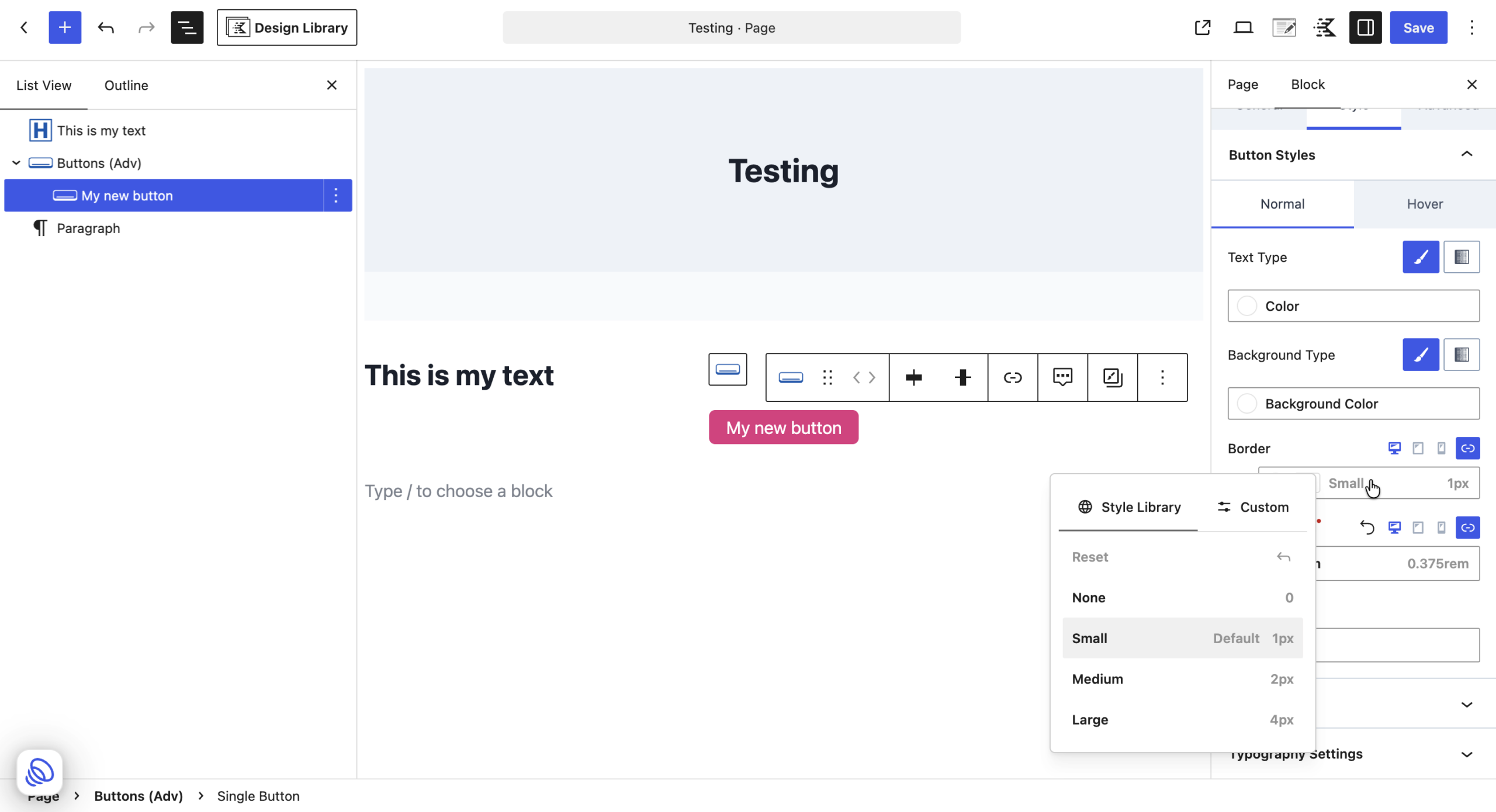
Border Width sets how thick borders are, so borders match across your blocks. On this screen the page heading reads Border.
| Name | Default Value |
|---|---|
| Small | 1px |
| Medium | 2px |
| Large | 4px |
- To change a width, click it, update the value, and click Save.
- To add one, click Add Border Width.
In the block editor, the border width list also includes None.
Spacing
Spacing sets the padding and margin steps your site uses, so gaps stay consistent from block to block.
| Name | Default Value |
|---|---|
| 2X Small | 0.5rem |
| Extra Small | 1rem |
| Small | 1.5rem |
| Medium | 2rem |
| Large | 3rem |
| Extra Large | 4rem |
| 2X Large | 5rem |
| 3X Large | 6.5rem |
| 4X Large | 8rem |
| 5X Large | 10rem |
- To change a step, click it, update the value, and click Save.
- To add one, click Add Spacing.
Your existing spacing is supported
Earlier versions of Kadence Blocks used short labels for spacing, such as SM, MD, and LG. These are linked to the matching spacing tokens and now show their full names (Small, Medium, Large) in the padding and margin controls. If you change the Small token, every block that was set to SM updates too.
In a Kadence block Advanced Tab, you can set padding and margin separately for each screen size (Desktop, Tablet, Mobile) and for each side (top, right, bottom, left).
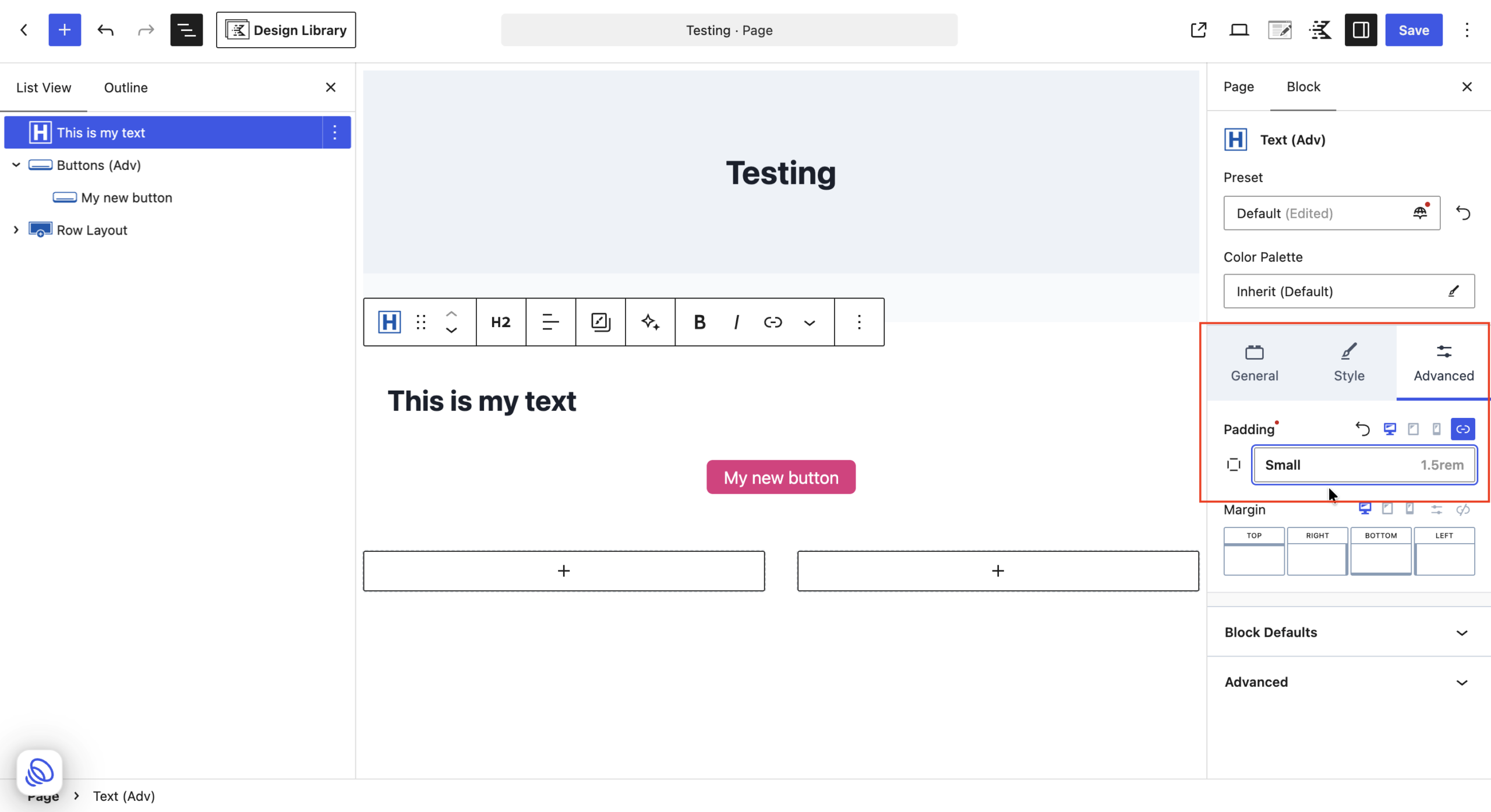
Note: A few older spacing controls, such as Column Gutter on Row Layout and Vertical Gap on Section, still show the NONE, SM, MD, LG buttons.
Icon Sizes
Icon Sizes sets the sizes your icons can use, so icons stay consistent wherever they appear.
| Name | Default Value |
|---|---|
| Small | 1rem |
| Medium | 1.5rem |
| Large | 2.25rem |
- To change a size, click it, update the value, and click Save.
- To add one, click Add Icon Size.
Shadow
Shadow sets the shadow styles your site uses, so depth looks consistent across your blocks. Your library starts with three shadows: Extra Small, Small, and Medium.
Edit a shadow
- Go to Kadence > Style Library > Shadow.
- Click the shadow you want to change.
- In the Edit token panel, set:
- Name
- Color: the shadow color. A solid, non transparent color makes the shadow easier to see.
- X: how far the shadow moves left or right
- Y: how far the shadow moves up or down
- Blur: how soft the edge of the shadow is
- Spread: how far the shadow grows beyond the element
- Inset: turn this on to draw the shadow inside the element instead of outside
- Click Save.
For example, the default Medium shadow is X 0, Y 2, Blur 8, Spread 0.
A shadow token holds all of these settings together. When you choose a shadow on a block, all of its settings apply at once, and when you edit the token, every block using it updates.
Tip: The default shadows are subtle and can be hard to see on some screens. If you want a more visible shadow, give it a stronger color and larger X, Y, and Blur values.
Choosing a shadow in the editor
On blocks that support it, the Box Shadow control opens a list with a preview at the top. The list includes None (the default), Extra Small, Small, Medium, and any shadows you add.
Your existing shadows
- Kadence Blocks where you already set a custom shadow keep that shadow exactly as it was. It is not linked to a Shadow token.
- Kadence Blocks that had shadow turned off, or never had a shadow, show the block’s default (no shadow).
Using Style Library Values in the Block Editor
Once your Base Styles are set up, you use them while editing pages and posts.
The token picker
Controls that support the Style Library show the current token name and its value, for example Medium 1.5rem or Small 1px. Click the control to open the token picker. It has two tabs:
- Style Library: lists your tokens by name and value. Click one to use it. The top of the list has Reset (or Clear for colors) to remove the value.
- Custom: lets you enter your own value, such as any color from the color picker. Custom values are not linked to the Style Library.
For colors, the Style Library tab lists your palette by group (Accent, Contrast, and so on) with a swatch for each color.
Responsive settings
Many controls have Desktop, Tablet, and Mobile icons next to their label. Click an icon to set a different value for that screen size. Border and Border Radius controls also have a link icon. When it is on, all sides or corners use the same value. Turn it off to set each side or corner separately.
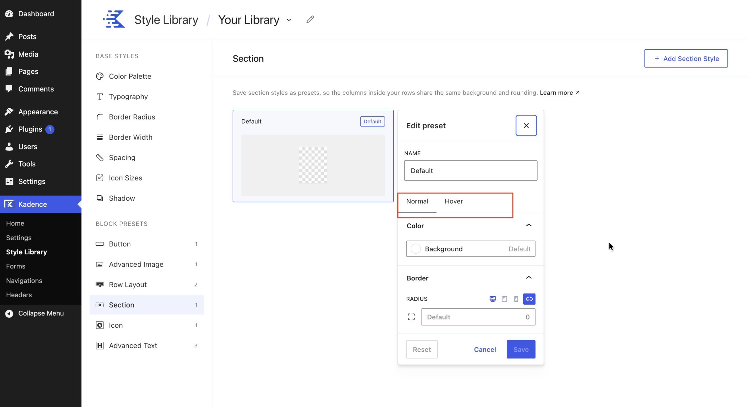
Hover styles
Some blocks let you style the hover state (how the block looks when a visitor points at it).
- Button and Section have separate Normal and Hover tabs.
- Icon shows its normal and hover colors on the same screen (Icon Color and Hover Color).
Block Presets
What are Block Presets
A block preset is a saved set of style settings for one type of block. Instead of setting colors, borders, and spacing on every block, you apply a preset and the block takes on the whole look.
The Style Library currently supports presets for these blocks:
| Style Library name | Name in the block editor |
|---|---|
| Button | Single Button (inside Buttons (Adv)) |
| Advanced Image | Image (Adv) |
| Row Layout | Row Layout |
| Section | Section (the columns inside a Row Layout) |
| Icon | Single Icon (inside Icon) |
| Advanced Text | Text (Adv) |
Other Kadence blocks, such as Info Box, do not have presets yet.
The Default preset
Every supported block starts with one preset called Default, marked with a Default badge. The Default preset matches how that block looked before this release, so nothing on your site changes when you update.
When you edit the Default preset, every block of that type that has not been customized updates across your site. This is the fastest way to change the look of all your buttons, headings, or images at once.
Managing presets in the Style Library
Edit a preset
- Go to Kadence > Style Library.
- Under Block Presets, choose a block (for example, Button).
- Click the preset card. Each card shows a preview.
- Change the settings in the Edit preset panel.
- Click Save.
Click Reset in the panel to return the preset to its default settings, or Cancel to close without saving.
Create a new preset
- Choose a block under Block Presets.
- Click the Add button at the top right (for example, Add Button, Add Image Style, Add Row Style, Add Section Style, Add Icon Style, or Add Text Style).
- Give the preset a name, set its options, and click Save.
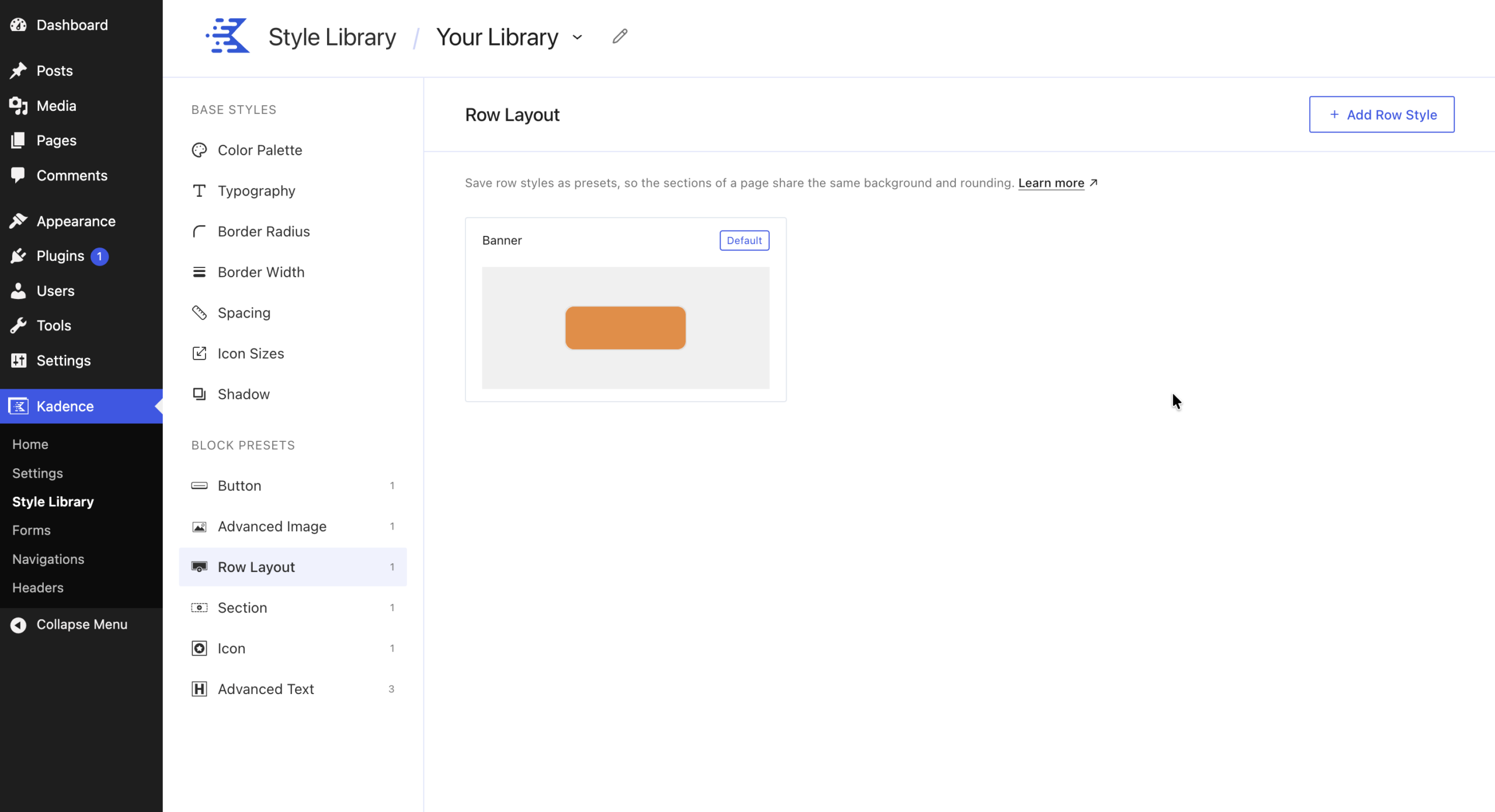
The new preset appears in the Preset list in the block editor for that block.
Using presets in the block editor
When you select a supported block, the Preset field appears at the top of the block settings, above the General, Style, and Advanced tabs.
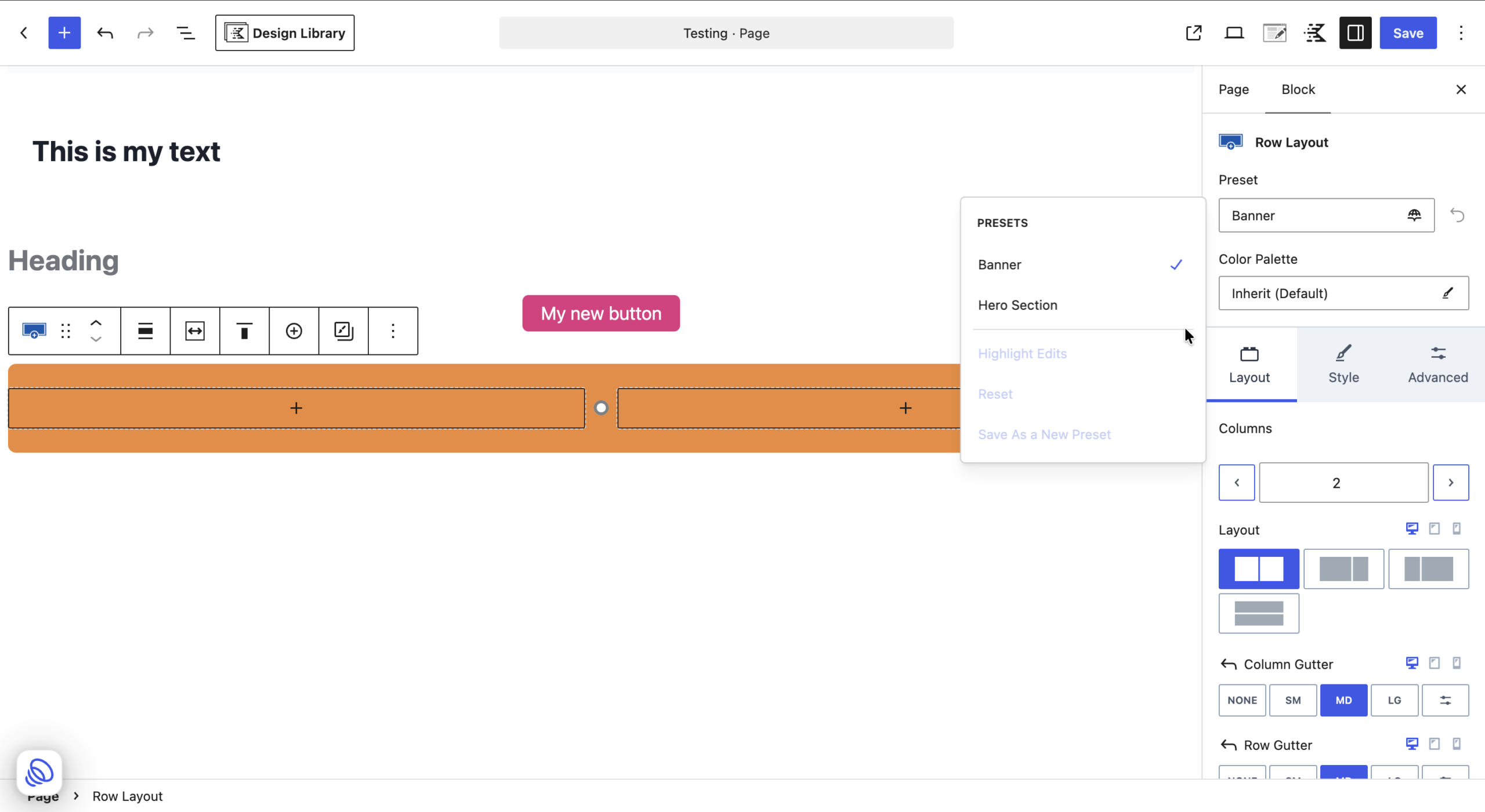
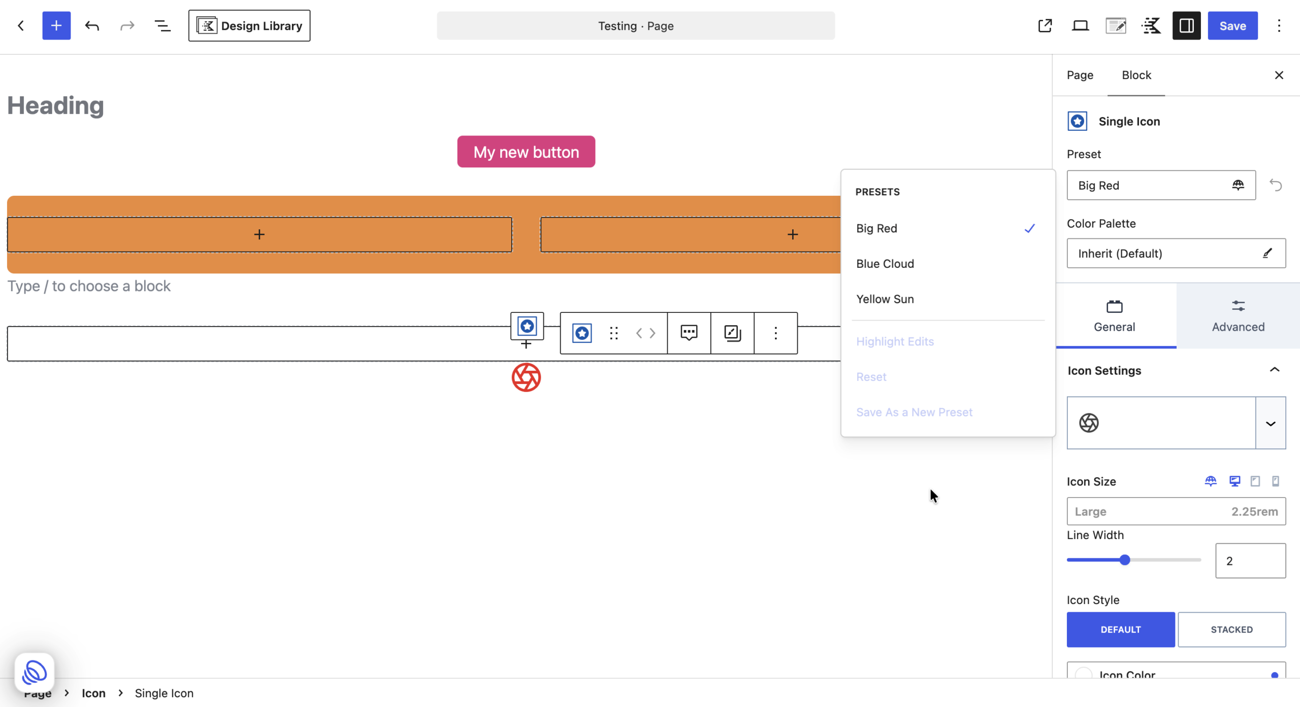
Apply a preset
- Select the Kadence block.
- Click the icon at the right of the Preset field.
- Under Presets, choose the preset you want. A check mark shows the preset in use.
The Preset menu
The same menu also has these options:
- Highlight Edits: turns highlighting of changed settings on or off.
- Reset: removes the changes you made on this block so it matches the preset again.
- Save As a New Preset: saves this block’s current styles as a new preset.
Highlight Edits, Reset, and Save As a New Preset are available only after you change a setting that the preset controls.
Changing a block that uses a preset
You can change any setting on a block that uses a preset. When your change is different from the preset:
- A red dot appears next to the setting’s label. Hover over it to see “Overrides the preset value”.
- A reset arrow appears next to that setting. Click it to remove your change and go back to the preset value for that setting only.
- The Preset field shows (Edited), for example Default (Edited), with a red dot on the menu icon.
The block keeps your changed settings and still follows the preset for everything else. This lets you, for example, use the preset’s font but give one heading a different color.
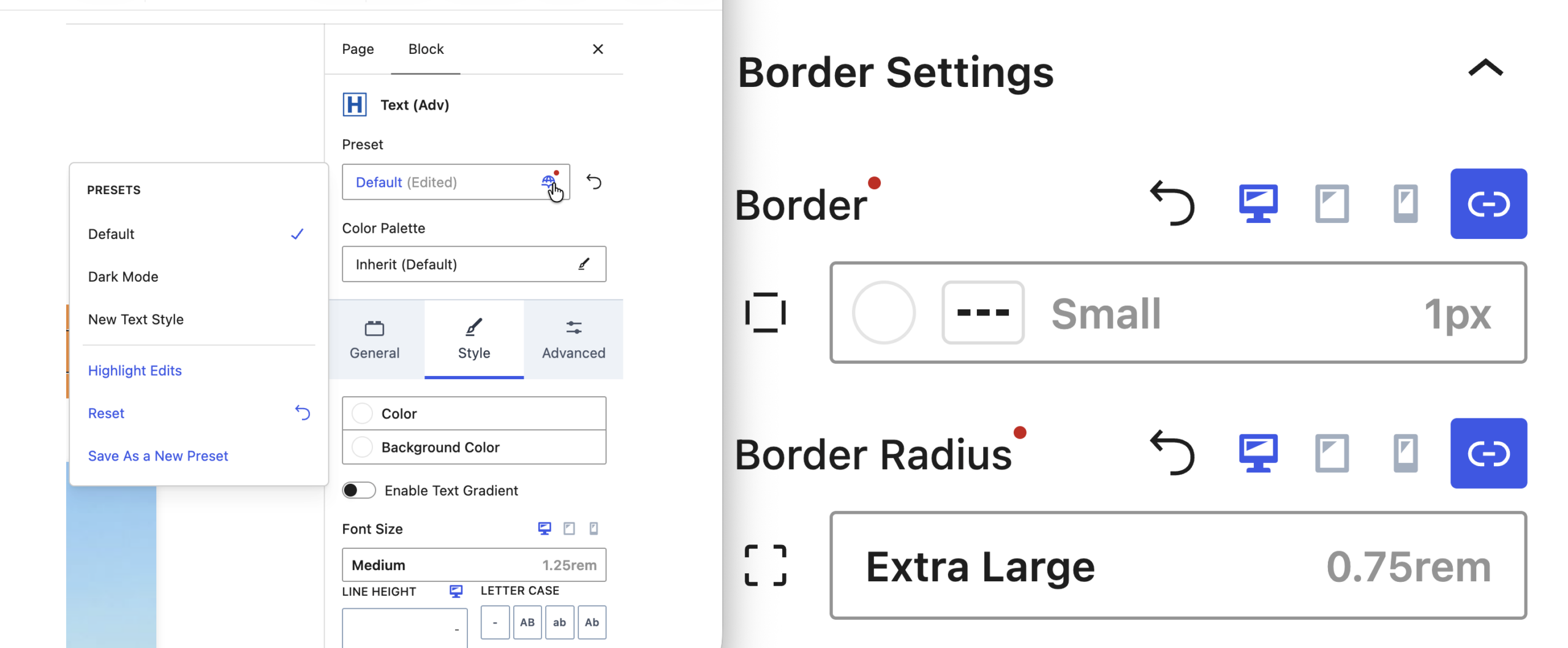
Note: You only see these signs when the preset itself has a value for that setting. If the preset leaves a setting empty (for example, the Default Advanced Text preset has no font size), changing it on the block does not mark the block as edited.
Save a block’s style as a new preset
After you style a block the way you like, you can save it without leaving the editor:
- Click the icon at the right of the Preset field.
- Click Save As a New Preset.
- In the Save as a new preset dialog, enter a Preset Name.
- Click Save preset.
The new preset is added to the Style Library and can be chosen on other blocks of the same type.
Switching to a different preset
When you choose a different preset, any changes you made on that block are cleared and the block takes on the new preset. Settings the new preset does not set fall back to the theme default.
When you edit a preset
Every block using the preset updates automatically, except for settings you changed directly on a block. Those keep your value.
“Theme Default” labels
Some controls that do not use tokens, such as Font Family, may show Theme default even when the block is using a value from its preset. The block still uses the preset value. This label means you have not set a value on the block itself.
Button
Use Button presets to give all your buttons the same colors, borders, rounding, shadow, and spacing.
What a Button preset controls (Edit preset panel in the Style Library)
- Normal tab
- Color: Text, Background
- Border and Shadow: Radius, Border (color, style, and width), Shadow
- Spacing: Padding, Margin
- Hover tab
- Color: Text, Background
Radius, Border, Padding, and Margin can be set per screen size and per side or corner.
Default preset values include a border radius of Default (0.1875rem), a border width of Small (1px), and padding of 0.4em 1em. The default background uses the Button color from your palette.
In the block editor (Single Button, Style tab), the Button Styles section has Normal and Hover tabs with:
- Color and Background Color: choose from your palette
- Border: color, style, and a width token (default Small 1px)
- Border Radius: token (default Default 0.1875rem)
- Box Shadow: token (default Default)
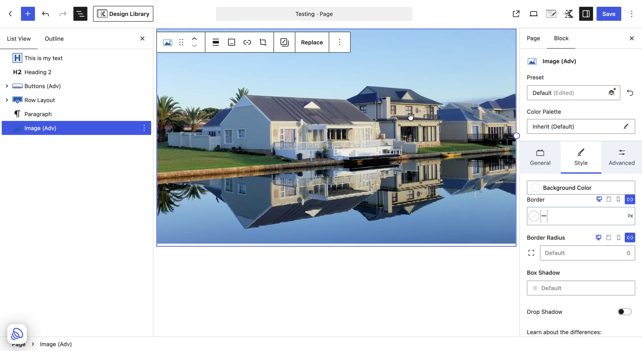
Advanced Image
Use Advanced Image presets so rounding, shadows, and spacing stay the same across your images.
What an Advanced Image preset controls
- Color: Background
- Border and Shadow: Radius, Shadow
- Spacing: Padding
In the block editor (Image (Adv), Style tab):
- Background Color: choose from your palette
- Border Radius: token (default Default 0)
- Box Shadow: token list with preview (None, Extra Small, Small, Medium)
- Border and Drop Shadow use the standard controls and are not linked to the Style Library. The Box Shadow vs. Drop Shadow link in the panel explains the difference.
Row Layout
Use Row Layout presets so the rows on your pages share the same background and rounding.
What a Row Layout preset controls
- Color: Background
- Border: Radius
Section
Section is the column block inside a Row Layout. Use Section presets so the columns inside your rows share the same background and rounding.
What a Section preset controls
The Normal and Hover tabs each include:
- Color: Background
- Border: Radius
Icon
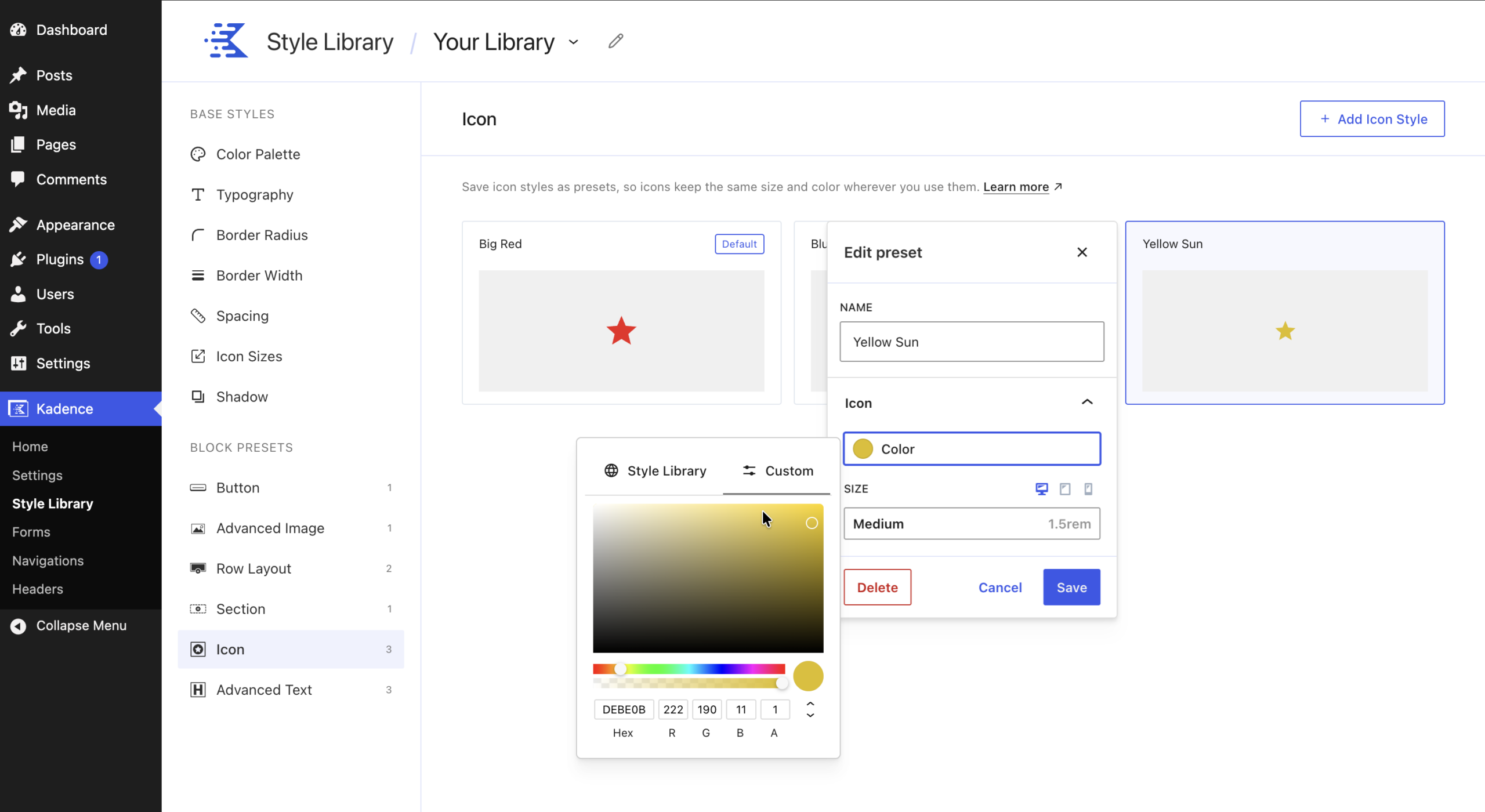
Use Icon presets so icons keep the same size and color wherever you use them.
What an Icon preset controls
- Icon: Color, Size (can be set per screen size; default Medium, 1.5rem)
In the block editor, select the Single Icon block inside the Icon block. The Preset field and the icon settings are on the General tab:
- Icon Size: token (default Medium 1.5rem)
- Icon Color and Hover Color
Advanced Text
Use Advanced Text presets so your headings and paragraphs look the same from page to page.
What an Advanced Text preset controls
- Color: Text, Background
- Typography: Font Family, Size (per screen size), Weight, Transform (None, Capitalize, Uppercase, Lowercase)
- Border: Style (None, Solid, Dashed, Dotted, Double), Width, Color, Radius
- Spacing: Padding
The Weight list only shows the weights the chosen font supports, so text always displays in a real weight of that font.
Example: Make all default headings larger and uppercase
- Go to Kadence > Style Library > Advanced Text.
- Click the Default preset.
- Choose a Font Family, a larger Size, and a Weight.
- Set Transform to Uppercase.
- Click Save.
Every Advanced Text block that has not been customized now uses the new style. A heading where you already set its own font size or color keeps that size or color, but still picks up the new font family if you did not change the font on that heading.
Quick Reference: Which Controls Use the Style Library
This table shows which controls on each block’s Style tab let you choose from the Style Library.
| Block | Uses the Style Library | Standard controls (not linked) |
|---|---|---|
| Single Button | Color, Background Color, Border width, Border Radius, Box Shadow | |
| Image (Adv) | Background Color, Border Radius, Box Shadow | Border, Drop Shadow |
| Row Layout | Background Color, Border Radius | Border, Box Shadow |
| Section | Background Color, Border Radius | Border, Box Shadow |
| Single Icon | Icon Size (General tab) | |
| Text (Adv) | Color, Background Color, Font Size, Border width, Border Radius | Advanced Highlight font size |
Blocks without presets, such as Info Box, use the standard controls.